There’s no better time than January to step back, reflect on the past year, and get excited about what the new year will bring. At Ekklesia 360, that means acknowledging the outstanding church websites and pages our ministry partners launched last year. We asked our team to tell us about their favorite custom designs from 2019. These amazing sites really stand out and are great examples of how to achieve strategic church website goals.
Wheaton Bible Church
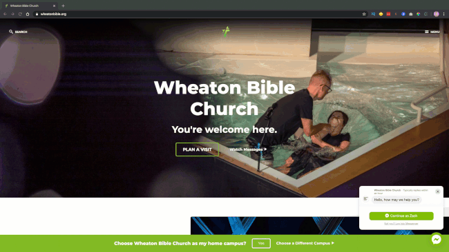
Wheaton Bible, a multi-site church, completed an Ekklesia 360 strategy project with goals to make their site a hospitable entrance to who they are and what they do. They wanted to make it easy for visitors to take action in joining worship, connecting in groups and serving on volunteer teams. They also wanted to make it clear that all of their campuses were part of something bigger.
“We used bold typography, large images, and subtle animation to create a homepage where they can highlight that Wheaton is: a place where people love God, grow together, and reach the world. Visitors can quickly see their mission and take action in each area. Additionally, we used a campus menu in the navigation to make it really easy for visitors to find the church closest to them and set it as their home. This enables a cookie, so content like events and sermons are already filtered for their home campus.” —Jenn Craycraft, Senior Designer
Muti-site church websites require smart navigation strategy. Check out Multi-Site Church Website Design to discover the three primary models your multi-site church website could take.
Highland Church of Christ
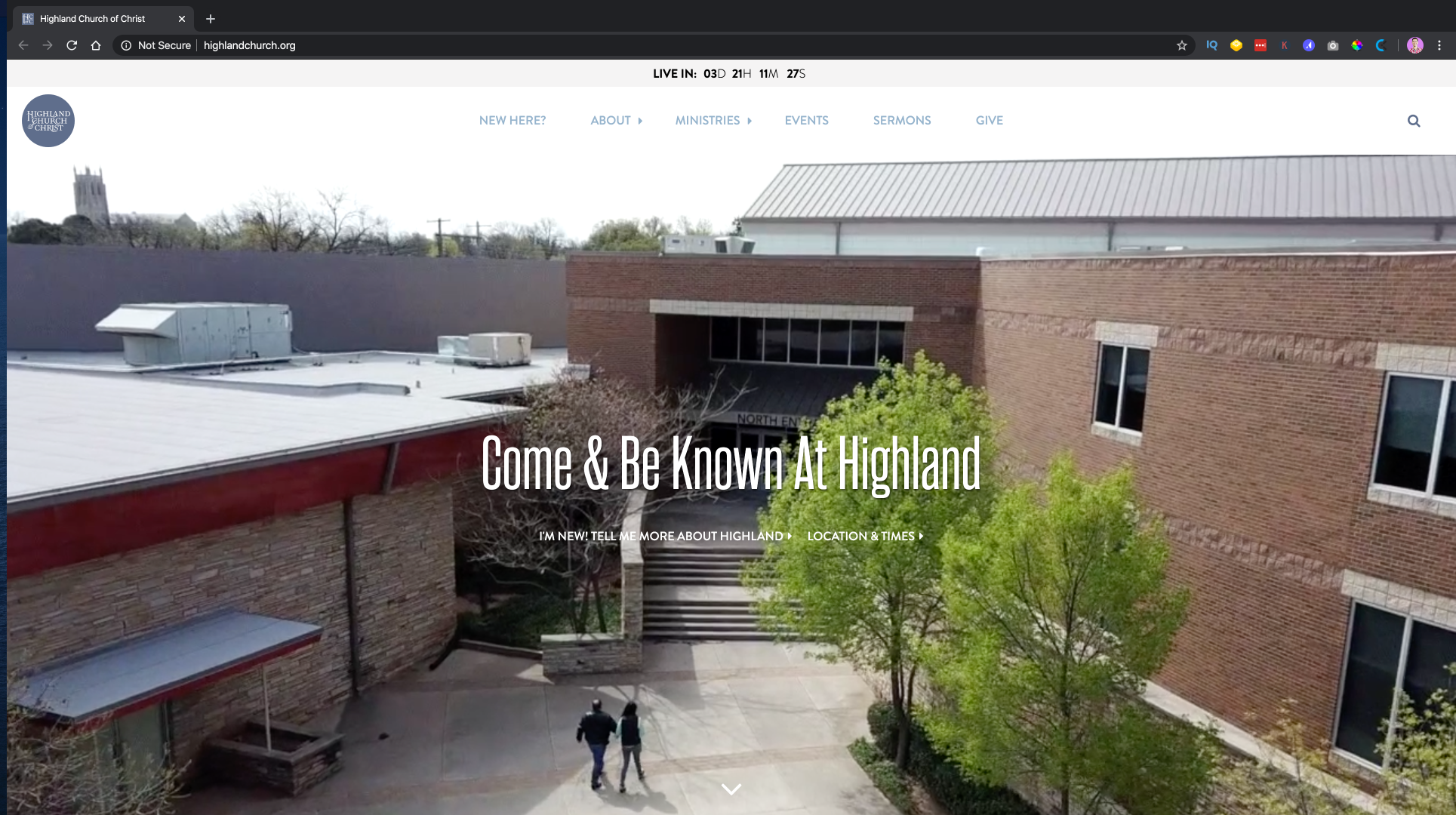
“Highland Church of Christ came to us wanting a simple and clean site. We worked directly with their church design team to design a site that not only communicated directly, but with style. We worked together to find similar fonts and styles they were already using within the church. This allowed their team to keep using the fonts they've always used and to easily apply their internal church designs to the website without much resizing and adjusting. This site is minimalistic and with a unique font pairing.”—Janis Jack, Designer
Learn more about optimizing church website goals here.
Worship Center
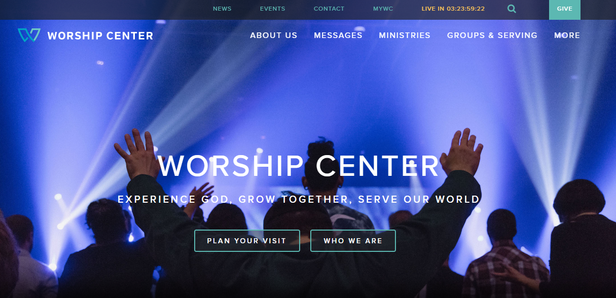
“Worship Center worked with Infantree on this custom design and it is a great example of how creative you can get with the layout. The site feels clean but also unexpected with broken grids and headings that stack vertically. They have also utilized layouts like missions and a group finder integrated with CCB.” —Jenn Craycraft, Senior Designer
Related articles: 10 Ways to Promote Missions; How to Connect Church Members to Small Groups
Ridgecrest Baptist Church (Dothan)
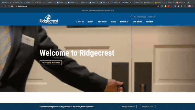
“On occasion we design for a church that does not want a lot of scrolling on their site but wants to deliver a lot of information. We designed the header and footer to remain static while the inner part of the site could scroll. This keeps the important elements prominent.”—Janis Jack, Designer
Learn about How to Get Members Engaged and Active on Your Church Website.
St. Paul's Prep
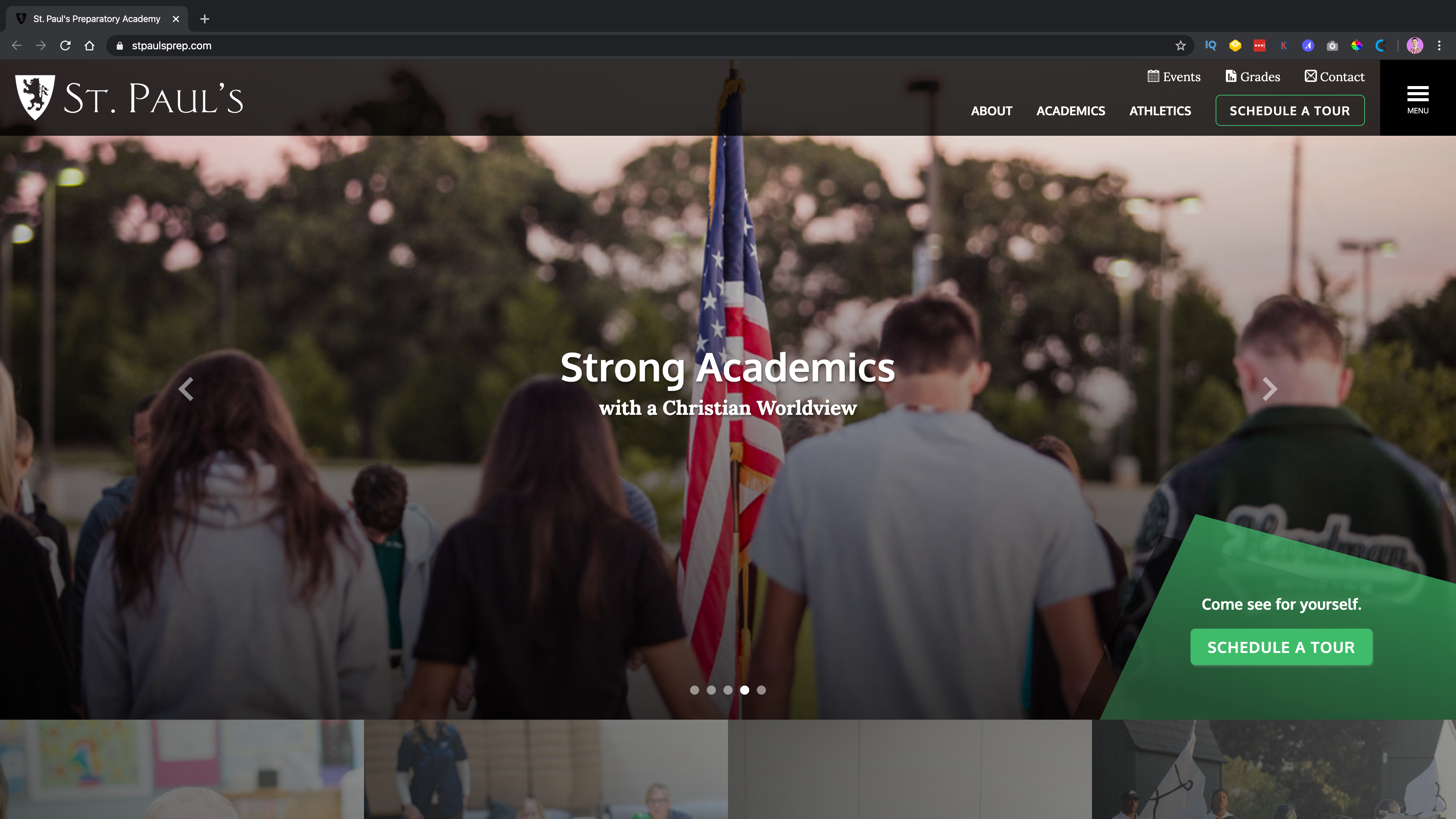
Paul's Preparatory Academy is a non-denominational Christian school for early childhood through grade 12. This school is an extended ministry of Faith Christian Center in Dallas-Fort Worth Metroplex.
“I worked with their team to create a site that attracts potential parents and families, highlights media, and provides resources for parents and families. We did a material design card style to organize blogs and events.” —Jenn Craycraft, Senior Designer
Check out these Six Tips for Your Children’s Ministry Page.
First Christian Church (Johnson City)
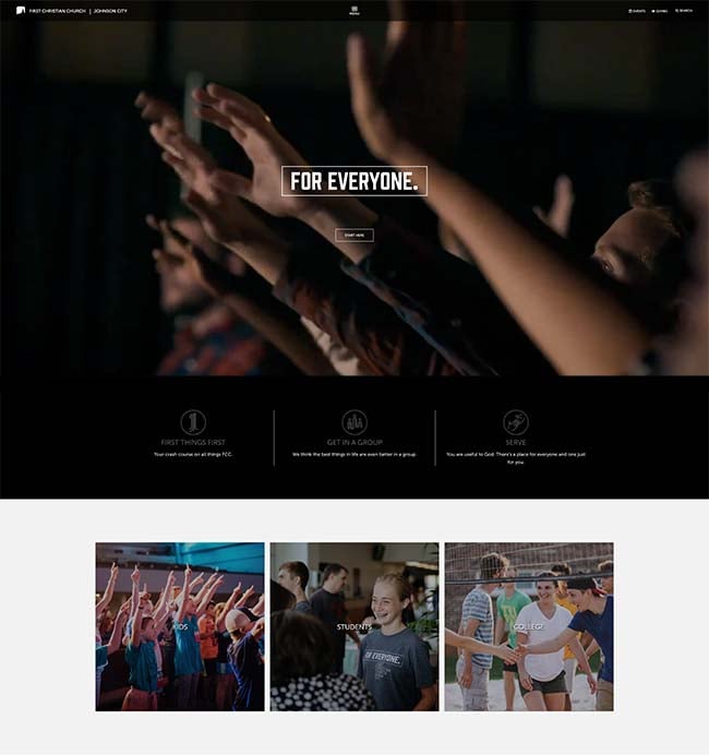
This site features First Christian Church’s photos against a neutral background. “Showcasing real photos on your site can really communicate atmosphere. We were able to design a website in grayscale, which allowed their church logo to remain white, complimenting their neutral style. The absence of color allowed their church photography to stand out. You get a wonderful sense of who they are.” —Janis Jack, Designer
If you’re like First Christian and want to keep things streamlined and neutral with real photos, you might want to check out A Practical Guide to Church Website Features.
College Park Annual Report Page
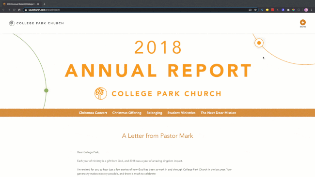
“College Park wanted to create a simple annual report to celebrate 2018. We used sticky anchor navigation to organize the page and animated their stats for a really fun interaction when scrolling down the report. They’ve included important metrics both on the page and in a downloadable version.” —Jenn Craycraft, Senior Designer
Psst! Learn how your church can be missional with your annual report here.
Beyond Websites: Designs We’re Excited About
Leesburg United Methodist Logo
![]()
This United Methodist Church wanted their own unique identity and brand — something that could connect them to their community a little more. They are in a very historic building and wanted that to be the idea behind their new logo.
“It was exciting to create a logo that was so simple and elegant from a building with so much history.”—Jenna Chambless, Designer
Learn pro tips for church logo design here.
New Theme with Major Customization Options: Trotter
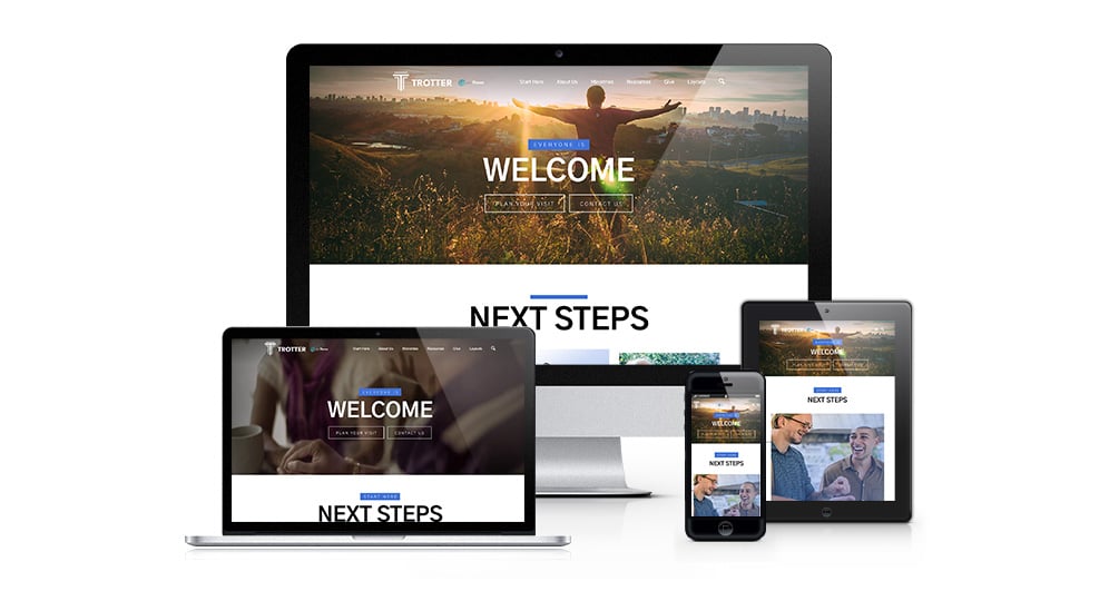
This mobile-first church website design theme includes pre-designed ministry-focused pages for sermons, story articles, blogs, events, and staff. We created layouts based on years of church website research, so strategy comes built in.
“I really love the movement and dimension of this site. We wanted to create a site that was more graphically driven and less photo heavy. We wanted to appeal to churches that may not have photographers on staff or might not have access to high-resolution photos. We created a very visually appealing site that does not rely on great photography to keep the visitors engaged and interested.”—Jenna Chambless, Designer
Learn more about Trotter here.


