As your church grows, your website needs to grow with it. Many churches with more than one campus, have tried to finagle their website and sort of "force" it work for a multi-site church. This can make a church website cumbersome -- if not downright difficult. The good news is, there are ways to do it without having to sacrifice all the cool stuff that every up-to-date church website should have. Stuff like upcoming event information, driving directions, photos, videos, social media links, and an online giving platform. All organized for a multi-site church!
If you are looking for inspiration on how to successfully make a website for your multi-site church work, here are six awesome examples that do it and do it well. You can also talk to our strategist in a deep-dive mission online assessment. You can learn more about that here.
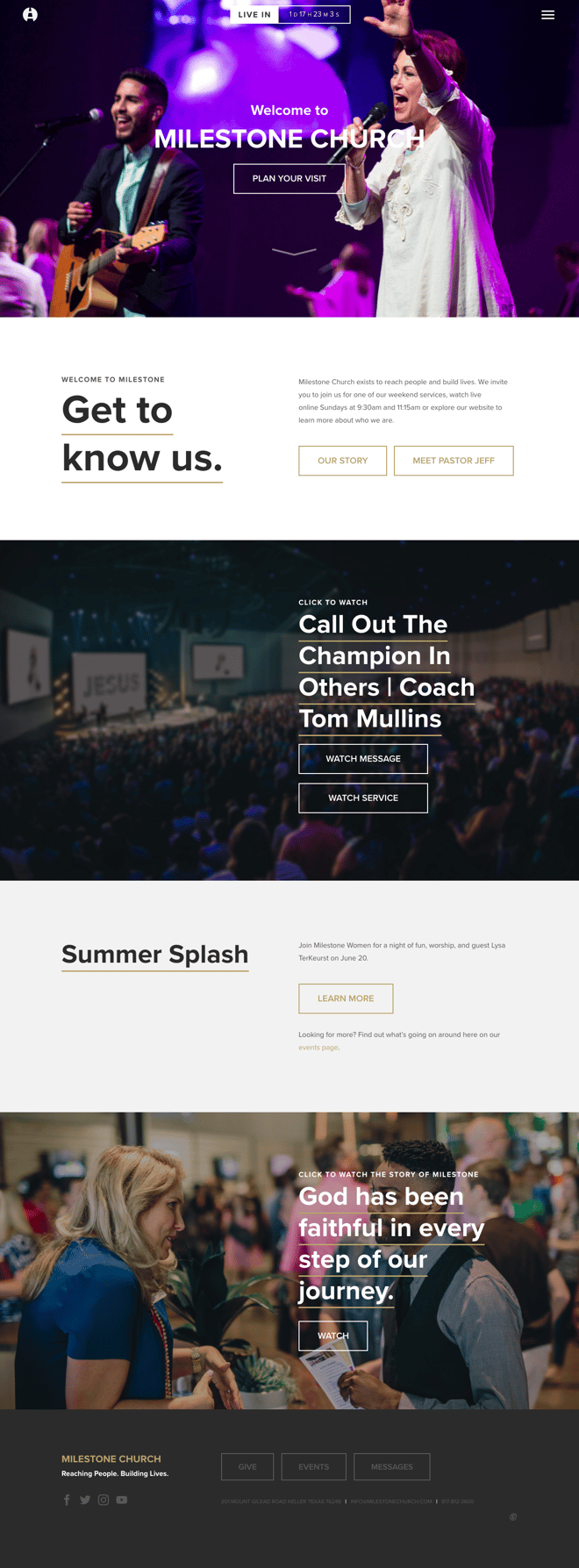
Milestone Church
We simply adore this easy to navigate multi-site church website. Just one click in the top right corner of their homepage will get you to the right-sided menu so that you can easily find the service times and locations for each campus at Milestone Church. Underneathttps://milestonechurch.com/h the campus names, you can find your way to church just by hitting the 'directions' buttons. With its simple layout and basic color scheme, navigating their website is smooth as silk. But just in case you do get lost along the way, the icon in the top left corner will always get you back to their homepage.

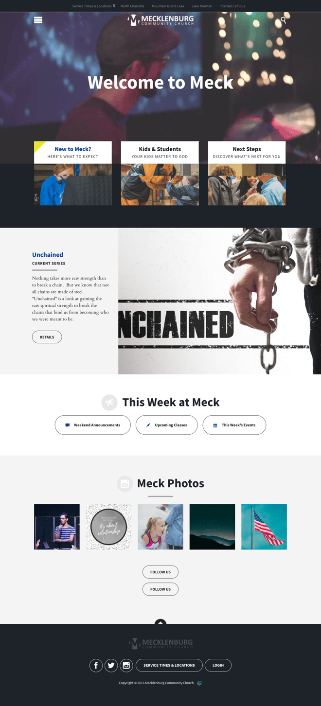
Mecklenburg Community Church
The video in the background on the homepage of Mecklenburg Community Church, aka "the Meck," is a great way to draw you in and make you want to explore their website more. The fact that they are a multi-site church doesn't make their website any more complex. Each of their campuses are listed at the very top of their website on a static menu bar that stays the same no matter which page you want to check out next. The service times for each of their locations is easily accessed on this same menu bar, as well as on the bottom of each page.]

Fellowship Bible Church
With everything flowing together so well, Fellowship Bible Church does a great job of using visuals, including a four-photo slide show on their homepage and their eye-catching icons throughout the site. You can easily find information about each of their campus locations by clicking on their strategically placed buttons at the top right and on the bottom of the page. If you are new to their website, there are two convenient places you can click to find out more about their church - one button is located at the top of the page and one is right in the middle.

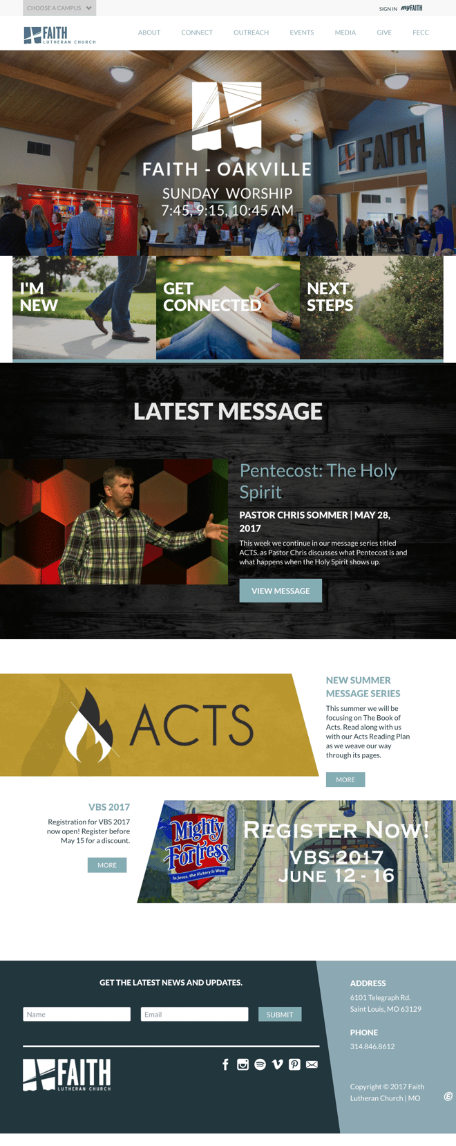
Faith Lutheran Church
This multi-site church has two different campuses and with their drop down button at the top left, Faith Lutheran makes it very easy to check out each of them. Besides the simple navigation, we also really like how they make it easy for you to find exactly what you are looking for, whether you are a new visitor to their site, want to get connected, or take the next steps to continue your faith journey. Another great feature is that you can simply scroll down to check out the current message from each location as well as filling out their form to receive their latest news and updates.

BridgePoint Church
All you really need to do if you want to navigate the BridgePoint Church website is to start at the top and then scroll and scroll some more. As you do, you'll not only find out where to click to find out about each of their campuses, you will also find out how to watch their live services as well as listen to past messages. Keep scrolling and you'll find information for kids, students, and current events. As you scroll, you will also get to view some great photos. When you reach the bottom of the page, there is a way to subscribe to their newsletter. One thing we also really like about this site is that they include their Twitter feed on their homepage.

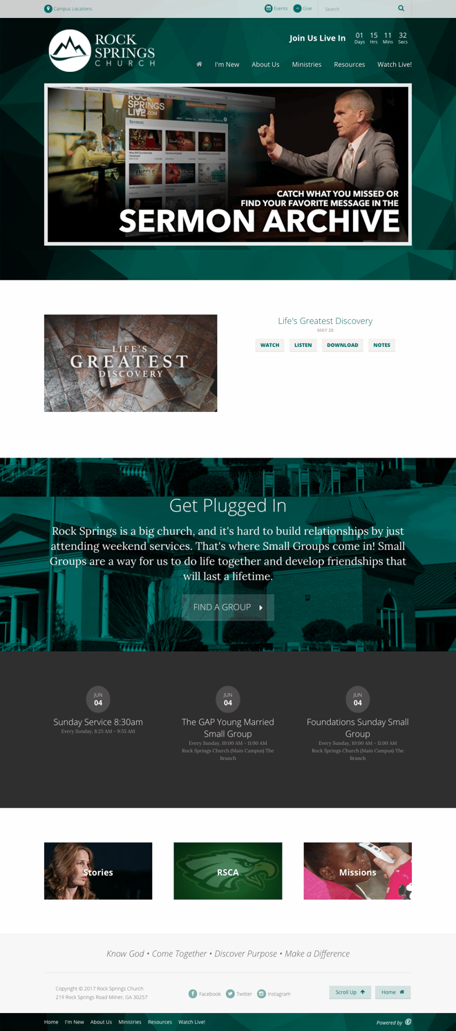
Rock Springs Church
This church really proves the point that no matter how many locations you have (Rock Springs has five of them), your website doesn't have to be confusing or complex. When going to their website, one of the first things you'll see is a slideshow featuring a welcome photo, current events, and a sermon archive. We also like how they have the same layout structure and color scheme for each of their locations. This cohesive look strengthens their brand while letting you know, without having to say it, that they are one church in multiple locations.


