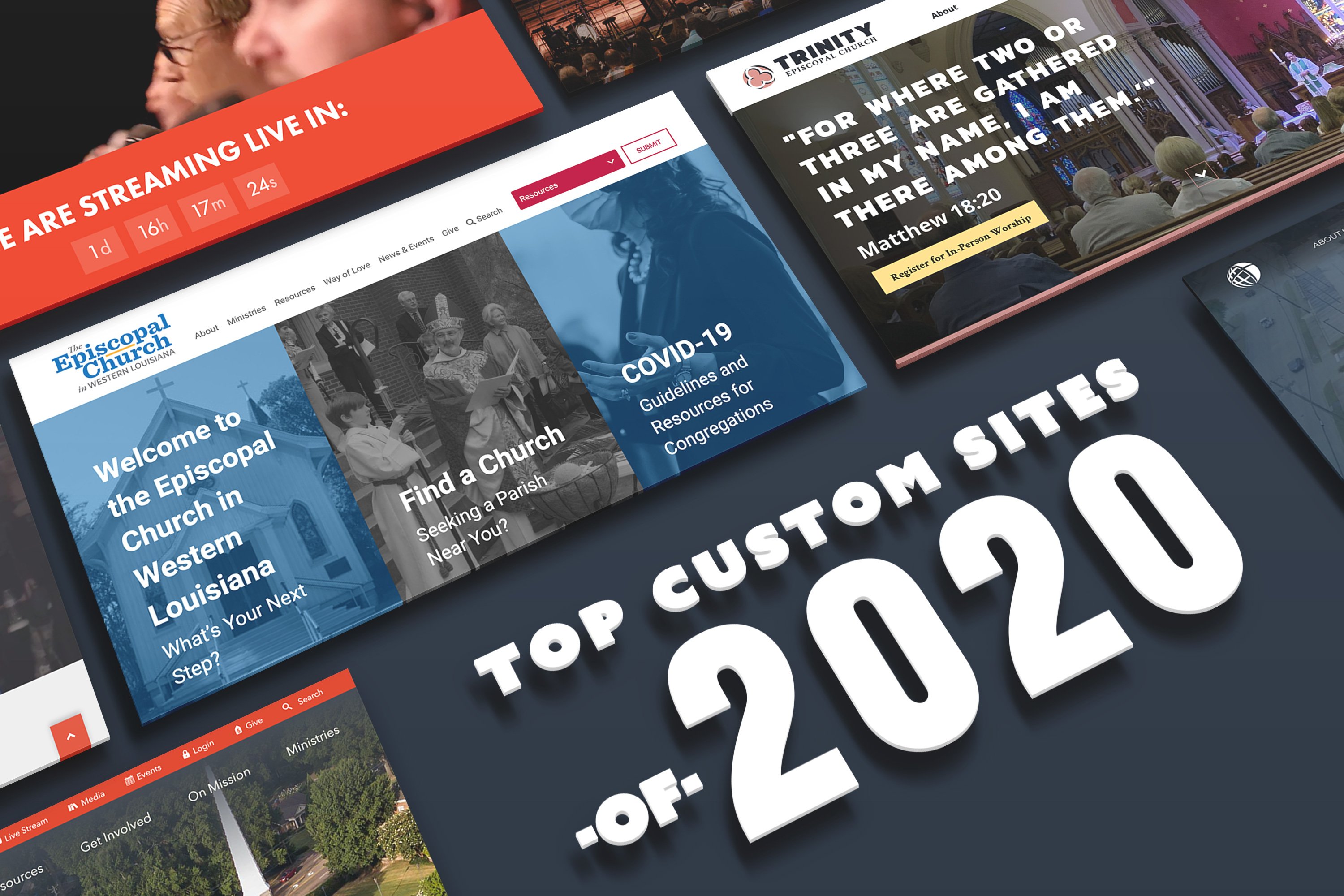
Church websites have had to make some big strides through 2020 as online ministry is becoming more prevalent in our society. The team at Ekklesia 360 has been blessed with the opportunity to partner with several churches this year and help them build and maintain their very own custom church website.
Here are 8 custom church websites that we believe will inspire other churches with ideas on how to enhance their online ministry going forward:
-
Zion Church
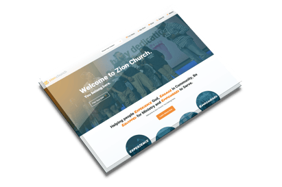
This multi-campus site makes selecting a home campus incredibly easy with a detailed locations page. Zion’s vibrant branding and use of modern illustrations give the whole site an exciting and friendly feel. -
Episcopal Diocese of Western Louisiana
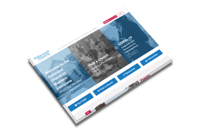
Episcopal Diocese of Western Louisiana needed a way to engage their audience to easily find the information they need but also keep their interest with photo placement. We designed a site that was easy for them to be able upload images to their site without having to worry too much about image quality. Almost all images on the site display with a color overlay, which allows low resolution images to display to bring interest to areas that need it most. -
Colonial Heights Baptist Church
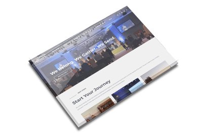
Colonial Heights is a great example of a modern website. They needed a site that could bring focus to their many ways to get involved. We were able to use a combination of color and text to really make the site bring a user in and keep them there. Sleek lines and small text make the site sophisticated and modern. -
Highland Baptist Church Waco
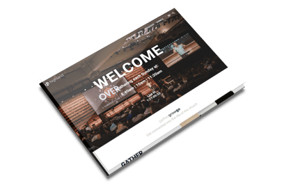
HBC Waco makes their vision clear with a homepage rotator highlighting their Gather, Grow, Go mission. The neutral color palette allows the site photography and custom graphics to shine.
-
Second Presbyterian
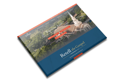
The combination of serif and sans serif fonts used throughout Second Presbyterian’s website creates a feeling of conservative and traditional yet modern design. The color palette, though somewhat bold, still feels warm and welcoming.
-
Hunters Glen
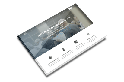
Through the use of color, full width sections, and engaging videos & photographs, Hunter’s Glen Baptist’s website is energetic and aesthetically pleasing while also being very user friendly for an older demographic. Each section has a simple yet engaging design to showcase content without being overly complicated. -
FBC Rogers
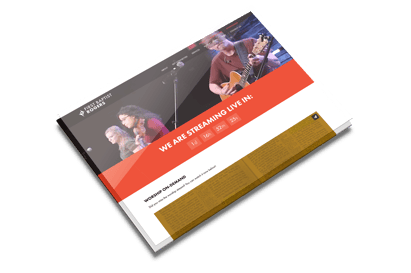
This site is designed to make it easy for visitors to get involved, connect to the church, and learn about FBC Rogers. Each section is designed to showcase opportunities for visitors to get to know more about FBC Rogers and get connected to the community. -
Trinity Nola
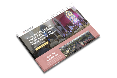
Trinity is known as “the big pink church” and used that as a reason to go bold on their new site. Beautiful photography and a unique palette give site visitors a feeling of what it’s like to be in the heart of New Orleans.
Next Steps
Is your church in need of a better church website experience? Ekklesia 360 provides powerful church website solutions for churches of every size. Whether you're looking for a ready-made website that's easy to build and maintain on your own or in the market for something custom-built and designed for you, our team can make it happen. Get started with a free Mission Online Assessment to meet with one of our experts and get the perfect website strategy for your church.


