
Your church website is important, not just for your current members, but also for those looking for a church to attend or a church to call home. For members, your church website offers a way to keep up with special events, read the pastor's latest blog post, and give online. For those who don't attend your church on a regular basis, your church website is likely the primary way for people to find your church and learn about what to expect.
Because you have both members and visitors checking out your website, you need to make sure your website is inviting to both parties. And when we say inviting, we mean it looks like a website that someone wants to visit and stay for a while. Your website should also be user-friendly and fun, with easy-to-follow next steps.
While it might sound easy to engage visitors on your church website, actually doing it can take time and effort. To help you with this, we have come up some easy ways to increase the engagement level of your visitors.
1. Make Your Visual Hierarchy Apparent
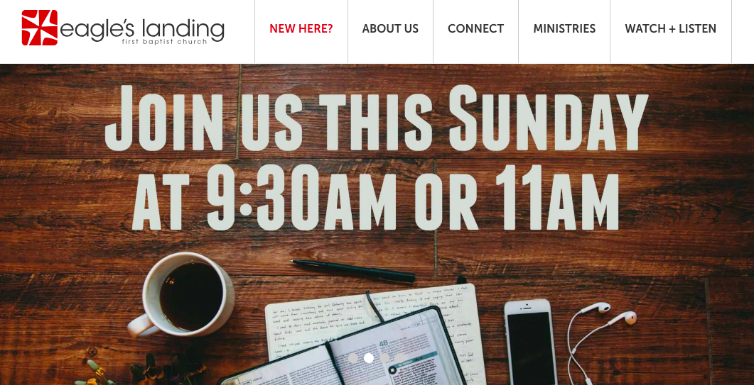
What are the most important parts of your church website? These points need to stand out on your home page:
- Service times and locations
- Sign up for small groups, volunteering, and missions
- Online giving
- What to expect
Some of the most engaging church websites have their crucial information somewhere on the homepage. And if the content isn't listed directly on the homepage, there's a good chance there is an easy-to-find button that will direct its users to that information. Speaking of buttons, don’t make them all the same size and color or the user will get lost and not know where to click.
If you are unsure about the most important parts of your church website, investigate! Heatmapping software can help you figure out what content and which pages users find most important on your website and where they are getting stuck.
2. Keep Your Forms Short and Sweet
 There are different reasons for having forms on your church website. Maybe you're trying to attain contact information from people who have recently visited. Or maybe you have forms as a convenient way for members to sign up for volunteering opportunities or to take part in small groups. Whatever the reason, you'll want to make your forms short and sweet.
To do this, only include form fields that are absolutely essential. The longer the form, the more likely you are to lose engagement. The last thing you want when visitors are filling out forms on your church website is for them to get distracted by too much text, or confused about what to do next.
No matter what type of form you have on your website, here are some of the most important fields to include:
- Name
- Phone number
- E-mail address
You may or may not want to ask for the mailing address. Also, even though you want to engage visitors, don't ask for their age or birthdate, as it might seem too personal. In other words: if you don't have to know, don't ask.
3. Only One Call to Action Per Page, Please
When visiting a website for the first time, users can easily get overwhelmed by the amount of information and content on each page. If there are too many calls to action, it may cause them to be unsure of what to do.
You want visitors to be responsive when they go to your website, but pulling your viewer in 10 different directions will only have negative results. They will either become totally confused and leave your website, or they will click on an offer they aren't quite ready for, and then they’ll leave.
If you want to truly engage your visitors, it's crucial to have only one call to action on each page.
For example, on your mission page, your one and only CTA should involve having visitors sign up for an upcoming mission trip. Don't include things like, "click here to find out more about our upcoming small groups.” This would only distract viewers from your main goal (encouraging them to sign up for the mission trip).
4. Make It Personal
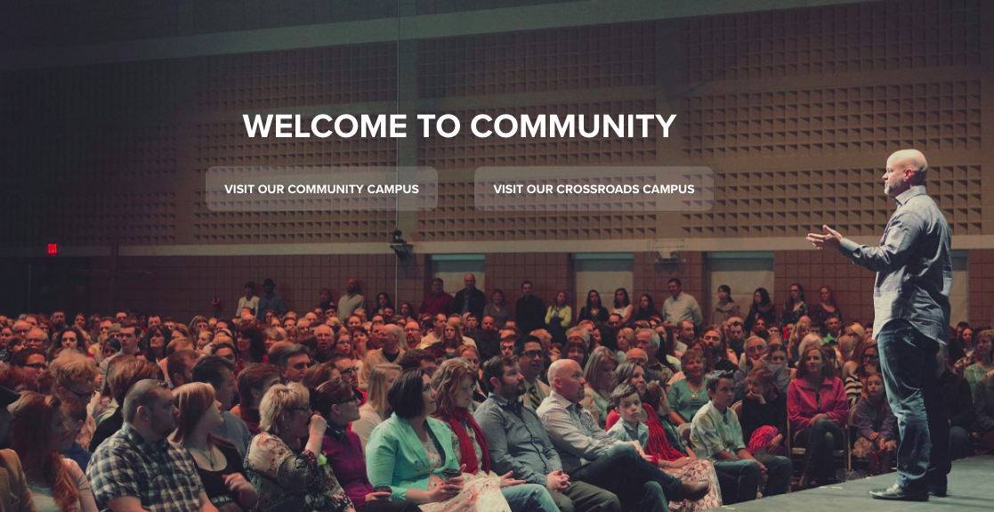 We know that we just told you not to get too personal when it comes to asking for certain pieces of information from your visitors when they are filling out forms. However, there is a time on your church website when you should get a little more personal, which can be done by showing your church in a more personal and intimate setting.
If you want to connect with visitors, include pictures, videos, and blog posts of real life things that are happening at your church. This will help prospective members get a feel of what goes on and who attends your church.
5. Be Creative!
Use graphics, text and images to make your website reflect your church’s brand. When adding photos, be sure to use actual photos for your church, not stock photos. Use bright and attention-grabbing colors on your calls-to-action.
Have fun and mix up your website images and text every couple of weeks. This way, visitors will be sure to come back to check out any new changes, making your church website appear fresh and relevant. To make your church website super engaging, you'll want to incorporate some of the most current design trends for church websites.


