The moment someone walks into your children’s ministry, they immediately form an opinion based on safety, security, cleanliness, etc. It’s very important for you as a church to make sure you get right. This same mentality transfers to your children’s ministry page on your church website. When someone visits this web page, you want them to feel welcomed. You also want to provide them with information that makes them feel confident in your children’s ministry. Since 69 percent of all churchgoers say they send their children to church to obtain a moral foundation, it’s important to make sure that this page addresses those concerns and communicates a welcoming atmosphere.
This all sounds good in theory, but how do you actually do this and what else can you do to make sure your children’s ministry website is up-to-date and makes people feel confident and secure? The experts at Ekklesia 360 have worked with thousands of churches and have developed a list of tips the very best children’s ministry pages employ.
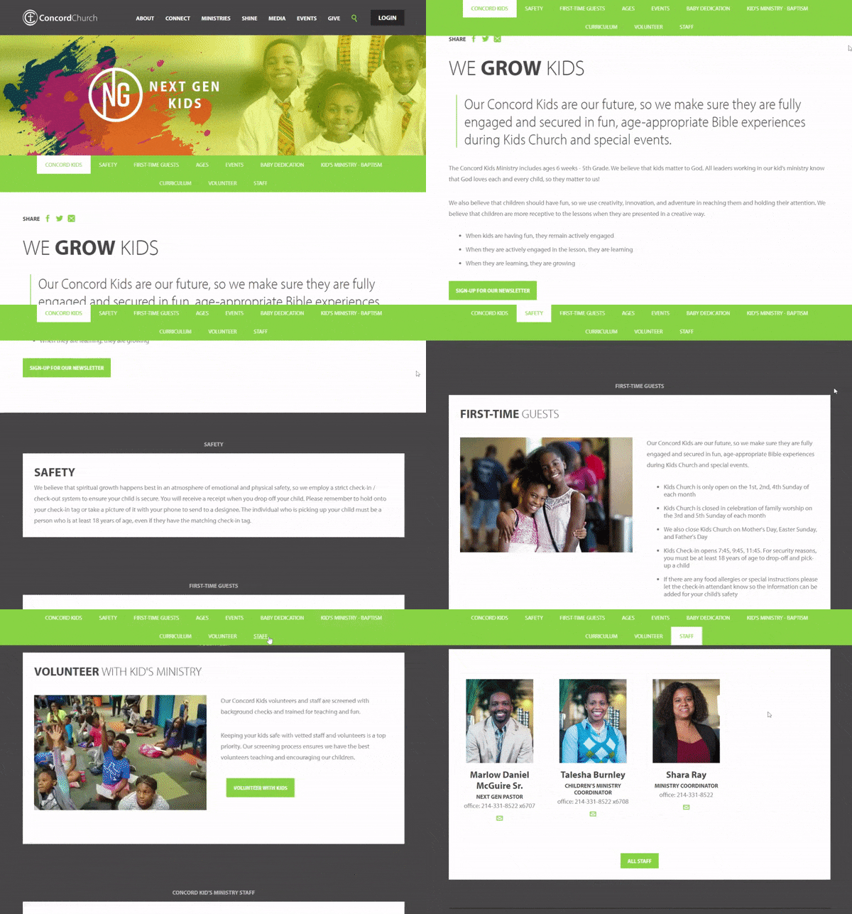
Check out this children’s ministry page from Concord Dallas and get inspired. It uses the Ekklesia 360 Ministry Layout and uses many of the tips we’ve included below.

Expert Tips For Your Webpage
1. Welcome Site Visitors with Pictures of Real People
As soon as someone clicks on your children’s ministry page, it’s important to welcome them. Research shows that people feel more welcomed when there is a face welcoming them rather than just a block of text. Showcase a picture of your children’s ministry leader alongside a brief welcome. This allows people to see a face they should see every time they visit your church and gives them a reason to scroll.
2. Use “You” Not “Us”
It’s important when creating this page that parents feel the focus is on their children, not solely on the church. Using words like “You” or “Your child” rather than “Us” or “We” consistently allows parents to see that the church puts a major focus on the child, which in turn gives the parents confidence in their programs.
3. Engage Church Website Visitors with Activities for Children
Add a take-home element to your webpage. Creating a section where parents can download a weekly coloring a sheet or Bible verses to memorize keeps visitors coming back to your webpage. You want the parents to be equipped to raise their children in a Godly home, and this is one way to encourage that environment.
In this section, be sure to also include space for parents to submit their email so you can continually promote this section along with any pertinent information.
Pro Tip:
Be sure to market this section to your parents. Send a weekly email to all the parents telling them new downloads are available on your church website with a link that easily takes them there. Tell your teachers to inform the parents that they can grab more information on the church website to help lead their children deeper into the lesson they learned that day. Whatever it is, make sure people know this section exists so it’s a useful tool, not a stagnant one.
4. Be Consistent on Your Children’s Ministry Website Page
Parents crave consistency when it comes to their children. It’s important that children know who their teachers are and are comfortable with them, which means you should have regular, weekly teachers. Once you have established these leaders, add their pictures and bios to your website. Creating a space for parents to see that their children will be with the same leader week after week eliminates anxiety. It also helps build stronger, lasting relationships. Showcasing that you do this on your website gives parents a reason to visit your church.
Next, include some classroom information alongside the name and picture of the leader for the age level. If you have a room for just crawlers, make sure to tell people that. If you have a room dedicated to children who are in the process of being potty trained, promote that too. The more information you can give, the better.
Pro Tip:
Do not promote the specific classroom number on your website. Withholding this information keeps dangerous individuals from knowing exactly where to go to access children of different ages. Rather, inform parents this information will be available to them at check-in so that their child is kept safe. You can also inform parents there will be people at check-in who can point them in the right direction.
5. Promote Events on Your Children’s Ministry Page
Dedicating a section on your website to promote events happening in your children’s ministry is a great way for parents to see what’s going on. It also provides an easy way for parents to sign their children up for events that require registration. Promoting events on your church website also helps with marketing these events because you can point people to register or find out more information by visiting your children’s ministry page. Once parents arrive at this page, they have the opportunity to see all the other things that go into making your children’s ministry successful.
6. Showcase Your Safety Procedures
Safety and security is likely one of the most important parental concerns parents when they’re considering a children’s ministry. In this section of your website, promote the ways your ministry keeps children safe. Here is a quick list of things to include:
- Check-in process
- Check-out process
- Cleaning procedures
- Allergy-friendly snack options
Also, be sure to promote your security guard if you have one. Showcasing someone who keeps your children safe shows the value you place on each child. You can also add emergency preparedness documents to this section so parents can easily download this information and read about what your procedures are in case of an emergency.


