Got something Important that you need everyone to know? Let’s get the word out! Ekklesia360 is now offering a great, new FREE feature to help keep your website visitors informed on your most important updates during this crazy time.
Getting Started
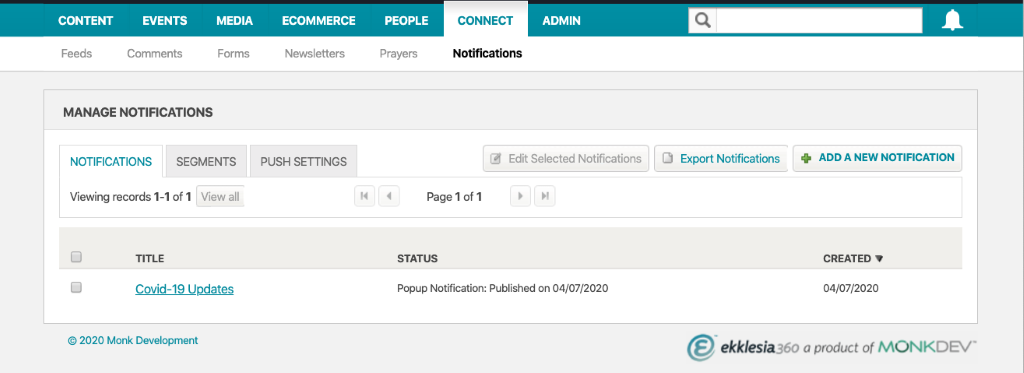
In the CMS, navigate to Connect > Notifications.
Select to add a new notification.

Create your header, content and add an image (if desired).
You can also manage and export your notifications in this module.
Churches Rocking the Pop-Ups!
As churches are making the rapid transition from open doors to serving their church members and community completely online, many have added pop-ups to keep website visitors informed.
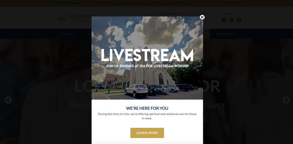
We love how The King's Chapel is using the pop-up! They chose an inviting image, and advertised their 10am worship service, as well as the spiritual and relational care offered during this crisis. When the visitor selects to learn more, they’re immediately redirected to the church’s live streaming page, where they can countdown to the next service, request prayer, join a small group and more!


Montrose Church is also using the pop-up notifications! They used theirs to clearly define their personal response to COVID-19, and to remind visitors that while they’re being safe, that church is so much more than a building. When the visitor selects to learn more, they’re funneled straight into all the online opportunities that are being offered- church online, youth programs, small groups and more!


Content Considerations
The biggest thing to consider is that a pop-up is designed for immediacy and brevity. The acronym “Keep It Simple and Short” (KISS) applies here. Think through a header that is 3-5 words and try to keep the body copy of your pop-up to 50 words or less. Remember, you want to tease the information, so less is more.
Then think through *one* way you hope your users respond. This is your chance to lead them where they need to go next; do it with intentionality. Make sure you call it out with an action button, so they can’t miss it!
If you use an image with the pop-up, the first (and obvious) recommendation is to find something that matches the topic well and stays with the tone of your brand. Beyond that, it’s also wise to think through ways your selected image might be interpreted (or misinterpreted) by your audience. For example, if you want to talk about closing your physical campus because of COVID, be considerate that the image you select doesn’t send your audience into a sense of panic or dread. Take time to think through a positive tone for your pop-up.
We hope this new pop-up feature makes it easier for you to get your visitors' attention for news and announcements you need them to see. Log into your site to get started and let our team know if you have any questions along the way. Happy building!


