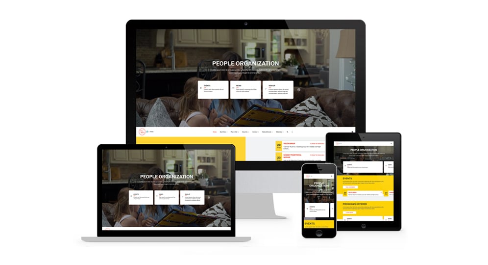
The team at Ekklesia 360 is excited to announce the release of our latest theme, Palmer! With the new Palmer theme from Ekklesia 360, you can build a website that has a clean, eye-catching visual presence that will engage your visitors and give them a memorable first impression of your church.
Side-by-Side Scrolling
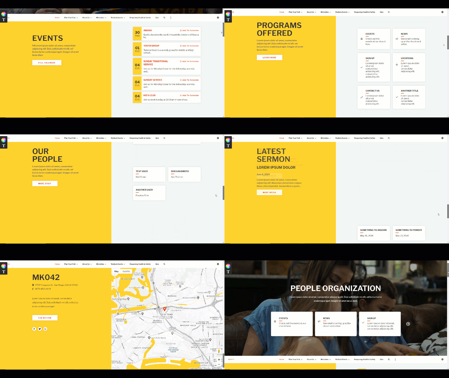
As you scroll down your home page, the right side of your screen will scroll through your website content, while the left side stays fixed and updates headers and paragraph copy as you go. The navigation header will also follow and stick to the top of the screen as you move down the page.
Light and Dark Modes
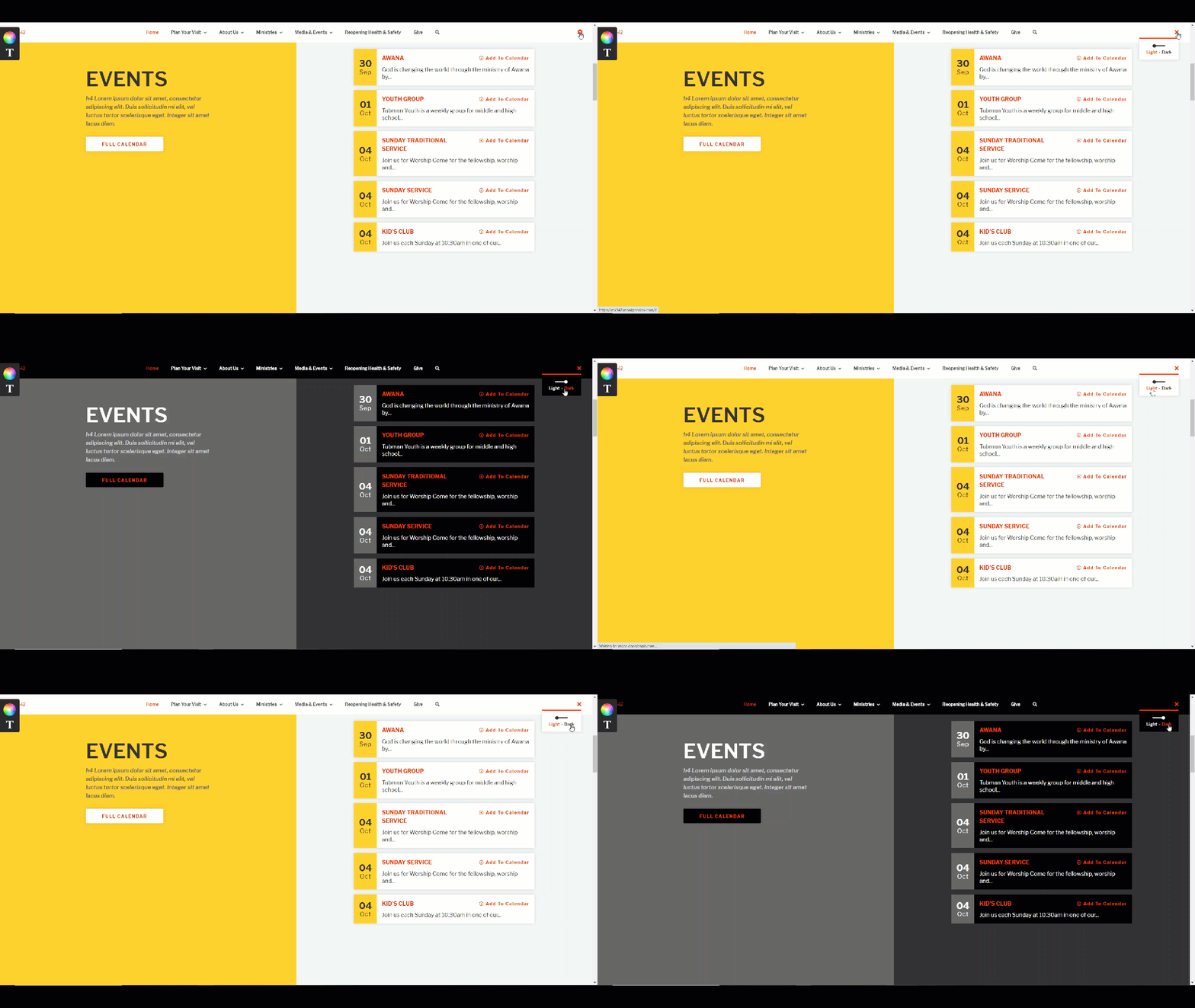
Palmer gives your visitors the ability to choose a “Light” or “Dark” mode for your site with a simple toggle at the top right of your website. This gives your visitors the freedom to browse your site with settings that are more comfortable for them.
In addition to these gorgeous visual aspects, extra features allow you to customize the look and feel of your home page to fit your church’s needs and personality:
Your choice of still image, rotator, or looping background video and text overlay
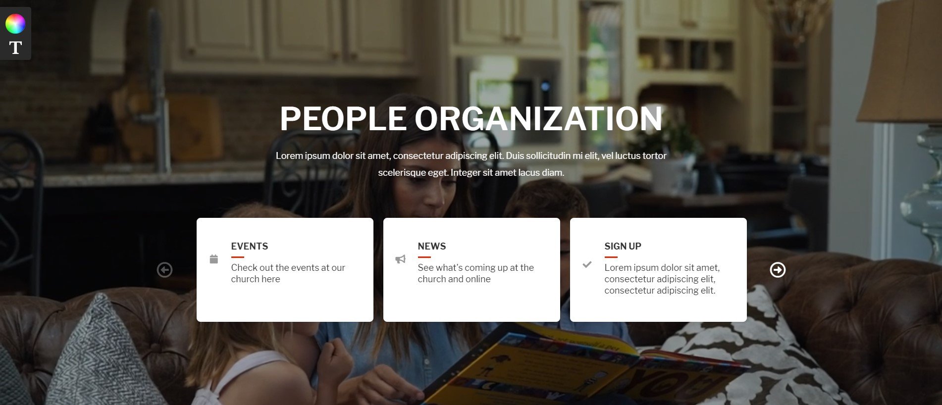
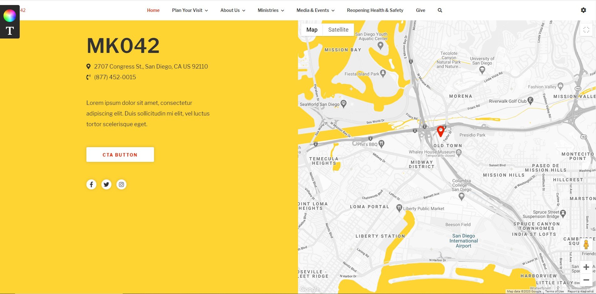
Built-in interactive map in the footer
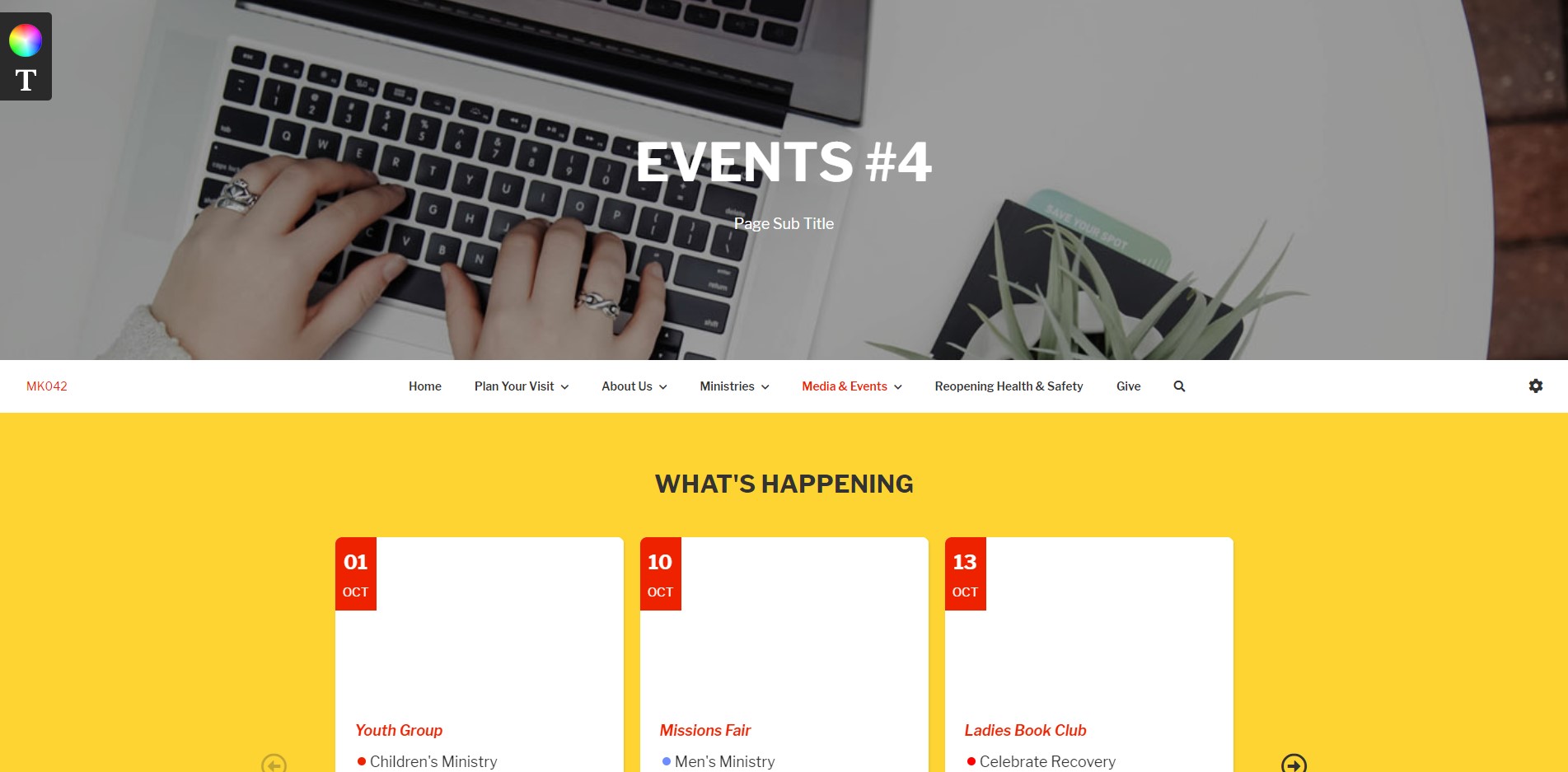
Ready-to-use sections for events, articles, staff, sermons, and more
Plus, easy social links to your social media channels and optional areas for an alert bar or header carousel with links to other pages!
Next Steps
These amazing features are just the tip of the iceberg! Now is the perfect time to take a demo of the Palmer theme for yourself and see how your church website can make a big jump in reaching and engaging more people this year. Our team is excited to help you reach your online ministry goals!


