There is an excellent chance that much of the reason your church exists is to reach others outside of the church walls. Most pastors and church leaders would agree that doing so is simply obeying Jesus’ instructions to, "Go and make disciples of all nations, baptizing them in the name of the Father and of the Son and of the Holy Spirit, and teaching them to obey everything I have commanded you" (Matthew 28:19-20).
Whether you are trying to reach underprivileged children in the neighborhood across the street or sending ministry teams to countries on the other side of the globe, this type of servanthood can be effectively described in just one word: missions.
Nobody will know about the missions or outreach work you're doing locally and/or globally if you don't have a page on your website dedicated to this important aspect of your church. And in addition to awareness, your church missions webpage is an important part of recruiting volunteers, missionaries, and others who want to serve in this capacity.
Before you start designing your missions page on your website, you need to clearly outline your message and your audience. What exactly are you trying to communicate, and to who? When you have defined these aspects, read on to get design inspiration from some well-designed church mission pages below.
The Need for Centralized Information on a Missions Page
The first step is to present missions opportunities to your church community so that they can take the next necessary steps to get involved.
Your church may partner with several organizations in your city, but very few members in your church community may know about the partnership. Or, maybe you have a handful of mission partners that you financially or ministerially support, but don't have any avenues to communicate the story of what those partners are doing globally. This is why you need a missions page that serves as a central source of information.
If you want your members to get involved in missions, you need to make sure they can find your church missions opportunities on your website.
Write Your Message with Your Community in Mind
When creating a missions page on your website, it’s important to remember that your church community and potential volunteers are your main audience. You need to create your message by thinking about what will resonate best with your church members.
Clearly communicate the purpose of the mission(s) and the next steps to get involved. Let them know about all opportunities to get involved, whether that be signing up for an outreach event, pledging to pray for a mission, or ways to contribute financially.
Provide testimonials and a point of contact to answer any of their missions-related questions. Once your message is outlined, you are ready to start designing your missions page.
Formatting Your Missions Page
There are two routes you can take when it comes to designing the format of your church missions page:
 A single landing page on your website where a user can find every opportunity available to serve: at the church, locally, or globally
- A single landing page dedicated to serving at the church with a separate landing page for local and global opportunities
The route you take will largely depend on how many missions opportunities are available at your church. For instance, if you have only a few opportunities at the church, local, and/or global level, it might be best to stick with one single landing page. However, if you have an abundance of mission options, it’s a great idea to create separate local and global landing pages. Get inspired by some great examples of missions pages below.
Examples of Well-Designed Missions Pages:
Journey of Faith
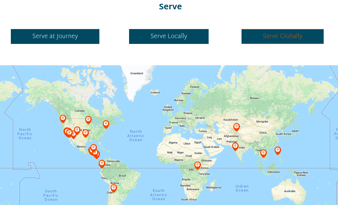
We love how easy this missions page makes it to find opportunities. By simply clicking the “church”, “local”, or “global” buttons, you'll get all the information you are looking for when it comes to missions. We especially like:
- The list of serving opportunities within church ministries
- The list of local serving events and outreach partners
- The map of missionaries and a featured story
Hope Church Las Vegas - Go Time
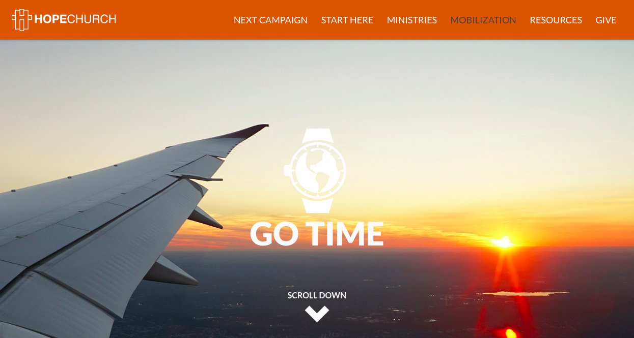
We love the beautiful graphics and parallax features of this missions page. The pictures and content not only enhance the design of the webpage, but also makes site visitors want to hop on a plane and go serve. Here are some other things we really like:
- Their “Go Time” video to communicate the big picture missions strategy
- The link to a page listing their missionaries and where they are currently serving
- The list of Local, National, and International opportunities
Mecklenberg Community Church - Missions 2.0
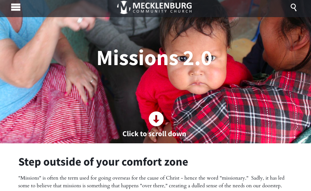
Who can't resist a sweet baby face? Besides the wonderful photo, we love how they emphasize “stepping out of your comfort zone” and how they define the word “missions.” We also love the following:
- Their great use of messaging that considers the user with “I want to”
- Their "Partner with a Ministry" which lists ministries, each with their own detail page that contains next steps to get involved
- The opportunity for users to indicate that they are interested in a certain trip, but want more information
Trader's Point
This church does a fantastic job of using video that makes it feel as if you are already traveling along on one of their missions trips. Other things we like about this missions page include:
- It has a page dedicated to general serving, and separate landing pages for serving the church, the community, or the world
- It has a simple list of opportunities, with the details laid out clearly and concisely on a separate page
- It contains an easy-to-find link to a short-term mission trip application
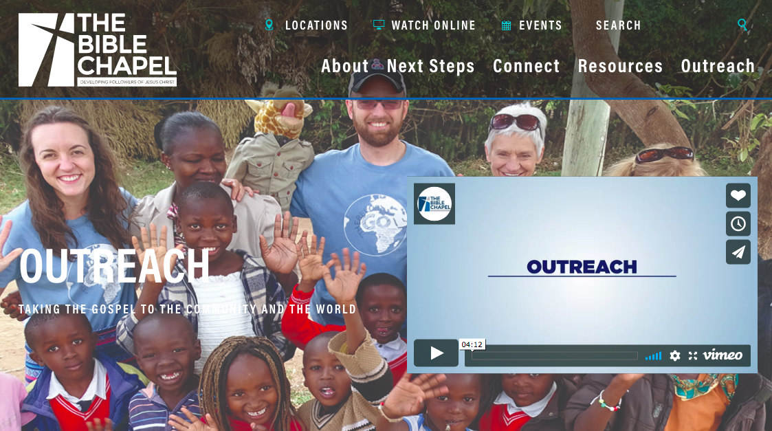
The Bible Chapel
We love powerful videos this church uses to attract volunteers. This church does a lot of outreach, but by breaking things up into six different categories with separate landing pages, they make their information easy to find. Other things we like about this webpage include:
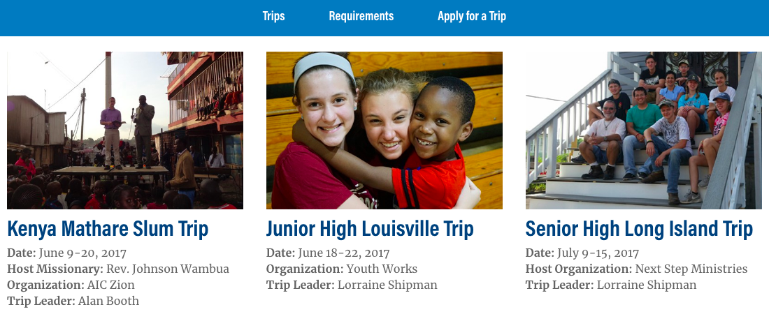
- They do a great job featuring their missionaries and upcoming mission trips
- They feature a blog that provides details about the different missions experiences

