
I’ve been thinking a lot lately about intentionality. Being intentional with my words, with my actions, and with my decisions. Sometimes we make decisions just because we like something or because we’re too busy to consider our other options. Other times, we make choices out of convenience.
But when we’re intentional with our choices, we start to consider how our choices affect the people around us. That’s an incredible thing! We feel like we are living on purpose and like we are part of something exciting.
If you’re considering a theme for your church website, your thought might be, “Ooh, I like this one. Done.” But today, I want to talk about finding balance between your awesome first impressions and making an intentional choice with the church website theme you choose:
Weigh Your Wants and Needs
You might just love one specific theme, but you’ll want to make sure your theme choice matches with your available resources and processes. Maybe you chose a very visual theme because it was striking and graphic––but if you don’t actually have someone available to film and produce videos or create graphics for your website, the theme will fall flat—and it may end up looking stale pretty quickly.
This is why the first step in choosing a theme is listing out your wants and your needs. Here are a few questions to spark conversation as you make a list of the features your church website should have:
1. What is the average age of your church, or the demographic you are focusing on? What are their wants and needs in your church website?
2. Do you have a staff member or volunteer that has the skills and time to create, find, and edit graphics or video on a regular basis? Or do you need a low-maintenance theme that a busy staff member can easily keep up with?
3. What are a few words you want to describe the design of your site? (trendy, simple, eye-catching, bold, calm. etc)
Identify Possible Themes
For the purposes of this blog post, we’re going to talk about our e360 themes because we know them best. If you're considering themes from other companies, fear not! These recommendations still apply.
After you have your list of must-haves and would-likes, it’s time for the fun part: shopping! Browsing themes is kind of like looking through Pinterest. It’s one of the most exciting parts (after going live, of course!).
The following list of themes are popular themes that may fit your list of desired website features. Find the features you identified as the most important for your unique church family, and then check out the theme demos to envision your site live!
Super Simple Homepage + Navigation
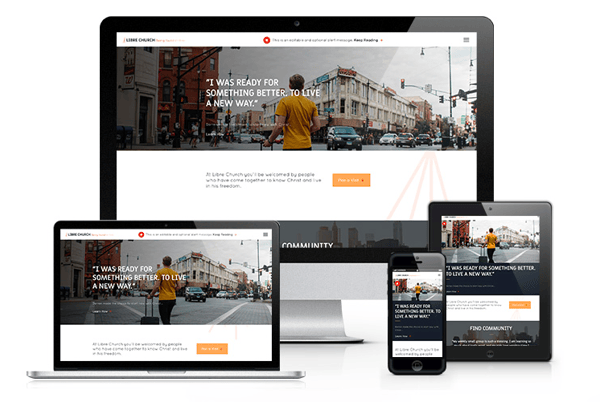
Our More and Parks (pictured) themes are best for keeping the homepage and navigation simple, but still having all the power of internal pages for each members’ unique paths. This simple navigation is great for guiding visitors to the correct path or action.
Parallax Design + Complex Navigation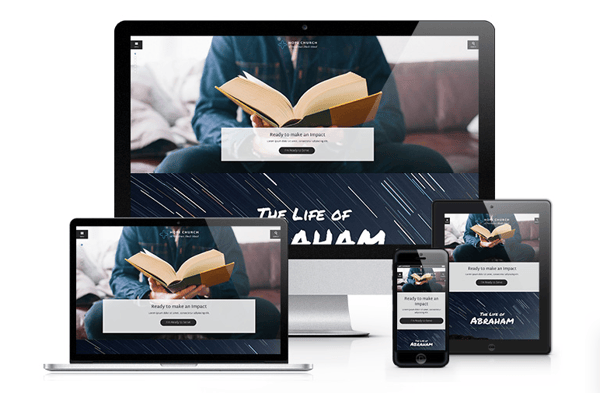
Parallax design refers to background images that adjust to your view as you scroll. It creates a more modern and intuitive feel for your website. Spurgeon, Augustine (pictured), Truth, or Elliot all have parallax capabilities and more robust navigation menus.
Looping Homepage Video
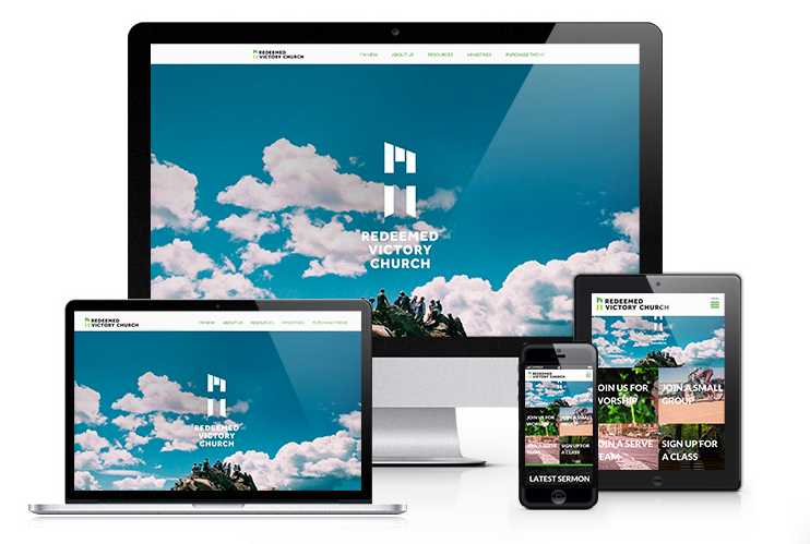
Video is a great way for a church to express their personality right off the bat. Augustine, Spurgeon (pictured), Elliot, Whitby, Truth, More and Parks all allow you to make a visual, moving statement right as a visitor arrives.
Updated Design & Functionality (think Bells & Whistles) + Traditional Feel
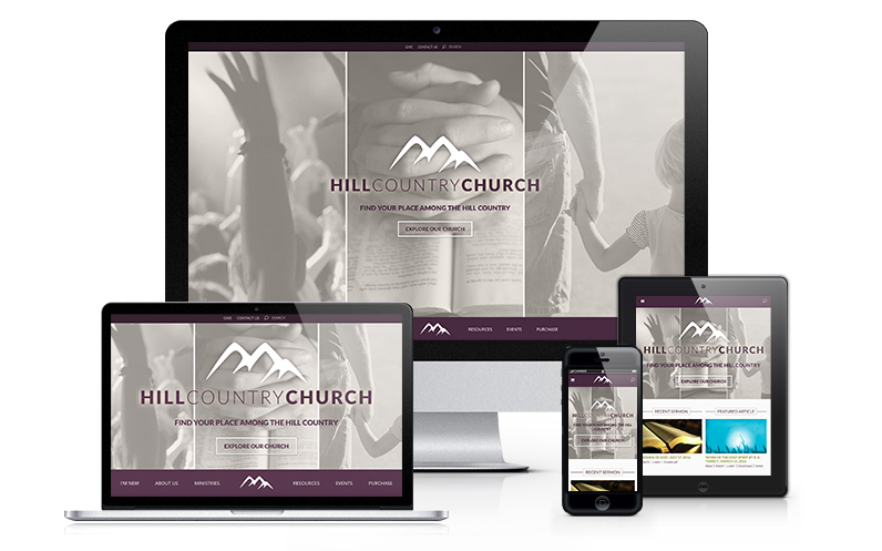
Check out Truth and Whitby (pictured) for options that have modern functionality, and can lend towards a more traditional feel. Perfect if you need an updated look and more content options, and your audience isn't full of Millennials.
Visual, Trendy Web Design + Animations, Full-Width Homepage Sections
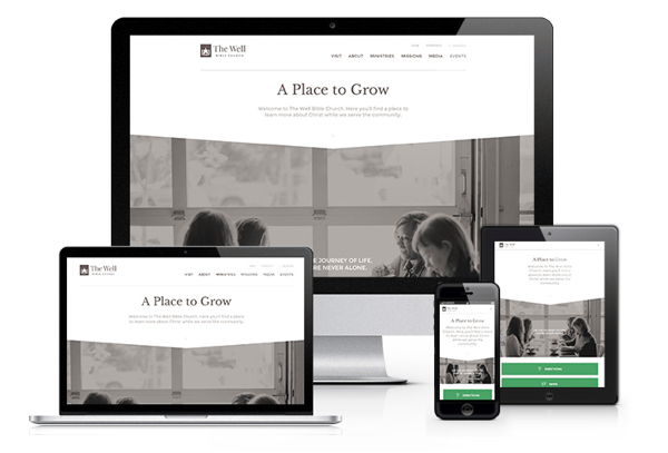
Augustine, Spurgeon, Whitby, Elliot (pictured), More, and Parks are all very image-heavy with large full-width sections that leave an impression on visitors. They also incorporate videos to show what your living, breathing church is really like!
Simple Navigation + Smaller Rotator Image Area
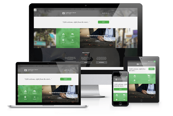
ten Boom has full-width sections on homepage, but smaller rotator images and an easy-to-navigate menu.
Welcome Message + Call-to-Action

Whitby, Elliot and Parks have a great area for an introductory welcome message and an immediate call to the visitor.
Simple Design + Traditional Look & Feel
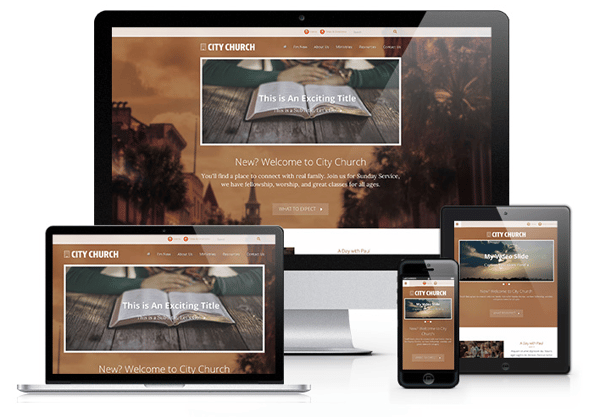
L'Engle is an example of a simple, straightforward design that lend to a more traditional feel, without too many bells and whistles.


