Are you trying to drive better engagement on your website? Or interact more clearly with your members? Do you have a lot of opportunities in your community, but you often hear that people just don't know what's going on? Does your congregation know how to get involved?
There's still time to for 2018 to be your year of the strongest growth yet. Help your website viewers understand clear and relevant NEXT STEPS they can take. Help them engage and grow into a deeper relationship with the worship and work of your church.
Today we are announcing a new Ministry Focused Layout -- and it is awesome! From the basic "little touches" like the hover effect on images before linking out, to the general versatility and usefulness, this new layout will help your church (and your church website) grow and flourish.
The NEXT STEPS layout works hand in hand with the NEW HERE layout. Use them separately or together. The "New Here" Layout is useful for first site viewers to help them get oriented to your church and your website. The "Next Steps" Layout is helpful for people who are looking to be more committed and "level-up" so to speak. No matter where your site viewer starts, you can help them become even more engaged.
Check out NEXT STEPS and keep reading to hear about the features of this new Ministry Focused Layout.
This layout has a big, editable text and image header. You can overlay text in more than one heading size and the background can be an image, rotator, or looping video.
Image Tiles
- This Layout is designed to use a Link List to elegantly and easily link out to other areas on your church website. Designed to link to other pages on your site or external URLs like a giving or ChMS page.
- And check out those cool hover animations! Really, click over and take a look!

Pop Up Sections
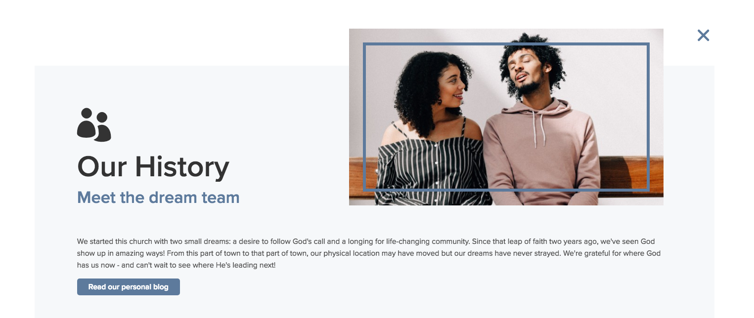
- The highlight sections use a pop-up style to give more information AND keep your users on your website. You earn their trust, keep their eyes on your church website, but also give your viewers more areas to click and find more info.
Floating Editable Link
- Look in the right hand edge of this template. See that "My Church Account" button. It stays with you while you scroll. This is a floating button that functions as a versatile link. You decide what to use it for: your database login in, newsletter sign up, volunteer opportunities, giving information, or anything else you can link to. Can also be turned off if you don't want it activated.
If you're ready to help your website viewers see real growth, consider the Next Steps layout from Ekklesia 360.
We've built it with fun new elements like pop up animations and well-thought-out sections to help your readers know where they are on the page. Ekklesia 360 is, as always, your ministry partner. And we're here to help your church grow and thrive!


