
Web design has been around long enough to go through many shifts. As web trends change, certain things become outdated. The way we look at and even experience the web is also in flux. Our design team has decades of web design experience -- not to mention our strategy and project management teams. Years of experience that we’re happy to pass on to you.
We’ve been talking to churches and church communicators for all those years, and we want to share the fruit of those conversations. Below are a few common myths we come across.
Myth #1 - Bigger and Bolder is Better
Your website is a space, but it does not mean you have to cram every bit of information onto that space. Yes your content is important, but also consider the space that isn’t there. A park is a lovely place because there is free open space. An amusement park as its attractions, but there is also space between attractions as well as to not overwhelm the park goer. Likewise, giving your site visitor information is good, but also do not overwhelm them with too much information. Having an eye-catching graphic is good, but don’t let it clutter up your homepage.
Solution:
It’s ok to be be subtle, less is more. You can give your visitor the most important information up front and then have a button leading to a subpage they can click through if they want more detailed information. You need to be intentional and have clear control over your content. It is beneficial to prioritize your information and display what you visitor wants.
Myth 2 - A new design will fix your problem
“I want a new, clean, modern design.” If I had a penny for every time I heard that, I would probably have three or four dollars. Everyone wants a shiny new site, and we keep our themes up to date and we’re on the cutting edge of current web practices. But a slick looking site cannot replace the lack of structure or organization.
Solution:
Almost regardless of the design, engaging content is the most important factor to have an effective website.
I cannot stress how important having a plan is, especially in welcoming a person to your church (wherever they are in the Christian walk).
- What can we offer this person?
- How can we get this person the information they need?
- Who is here to help this person?
These are questions you need to answer. It’s like a map to get to where you want to go. If you’re in Dallas, Texas and want to get to Charlotte, North Carolina, you’d need to plan which route to take and where to make stops.
Similarly, in the church context, developing a strategy will be helpful for encouraging a new believer to become a more mature and committed believer. You know your beginning point, and you know your end point, now you just need to plan the spots in between. With a plan in place, a visitor on your church website will be guided through a thought out process and will feel well taken care of. And that will speak to the competence and love of your church’s team.
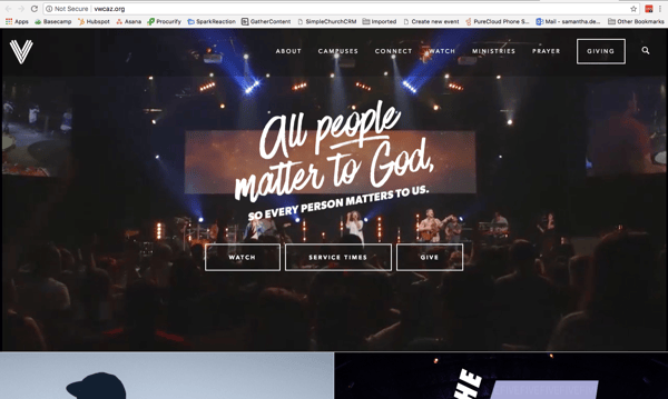
Myth 3 - Users Love Rotating Banners
On the internet, image space is vital. In theory, a rotator is a great way to feature many things in one space. But, in reality, you need to consider time. No one ever really stays to looks past the second slide.
Solution:
A good replacement for a rotator is a static image or moving background perhaps welcoming the site visitor to your church. You trade telling your site visitors about things happening at your church with welcoming them to your church. This is actually better because you’re making an emotional connection and helping them want to know what events and programs your church offers.
As the internet grows up, we are moving away from page-based viewing habits -- the site-browsing public is more and more willing to scroll and click. Especially if you give them clear direction in your menus, section headings, and calls to action.
Here's a great example of church that use a welcoming video instead if a rotator.
Our Augustine and Elliot themes also come with this feature!
Ps. If you really insist on a rotator, we’ve put together some best practices for rotators here.
Myth #4 - You View Your Site Like Your Visitors Do
You organized your church website a certain way, you know what you’re trying to say, you know what make your church unique and amazing. But, that doesn’t mean your visitors will view it with the same mindset and understanding that you have.
Solution:
You never know why people will come to your site. Some people will want to watch a previous sermon online, while others might want to find out your service times, and others may come to find information about your pastor. It is impossible to know why people come to your site.
The best you can do is make information simple and easy to find. And the best way to do that is to track, review, and make changes.No good website is ever truly “done.”
As you gather more information about clicks, searches, page views and general site usage, you can begin to make improvements. Make sure that your navigation is intuitive and the navigation items make sense. Not everything a site visitor will be looking for can be found on the homepage, and that’s ok. But you will need to make sure your links clear and concise -- and maybe swap some of them as you learn which pages get used the most.
If you’re an Ekklesia 360 customer, you can use your built-in analytics dashboard to do a lot of this research. It is a wealth of information for you to see which of your pages people visit, which buttons are being pressed, and to monitor the traffic on your site.
Web design trends and patterns will continue to change, but you can count on a few things that will never change. People will always need information, and people will want it presented to them in a way that makes sense.


