So you have finally decided to try online giving, or perhaps you've being using online giving for little while now, but you just aren't getting the results you were hoping for. Help increase donations to your church by having a functional and user-friendly online giving page.
This online giving page should be easy to access and effectively persuade your congregation to give. In order to achieve these things, the design of your online giving page plays a crucial role.
There are two main components when it comes to an online giving page: the design of your introductory giving page and the design of your checkout page.
The Design of Your Giving Page
Your giving page is important for a couple of reasons. This is the page that explains what exactly someone is giving to. Is it for a church renovation? Is it for a specific ministry?
Besides knowing what they are giving to, your giving page should also make two more things obvious: the "how" to give and the "why" to give.
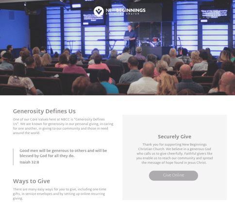
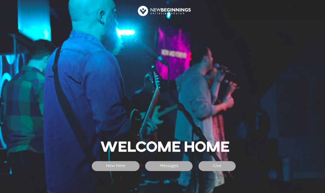
The giving page at The Zip Code Connection does a great job of explaining the “why” and “how”. Another example of a well-designed giving page from Green Bay Community Church. You will notice that both of these giving pages are simple and straightforward with an easy-to-find "Give Online" button.
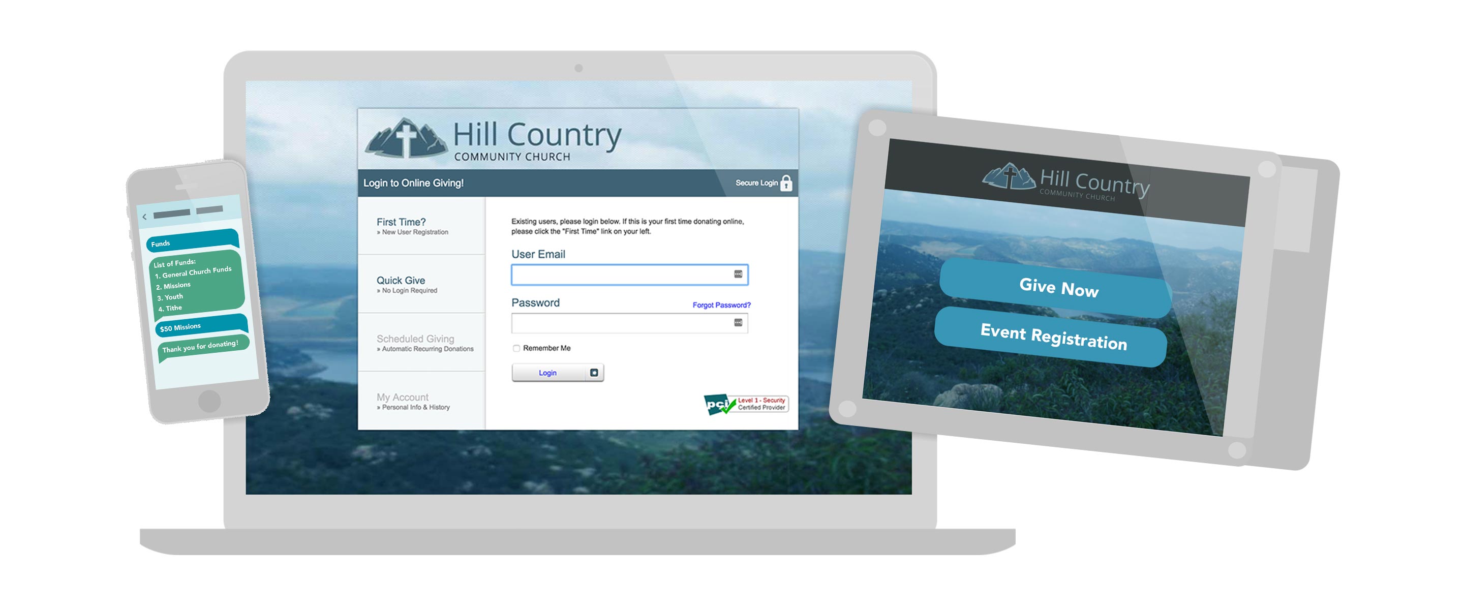
Ensure Your Page is Optimized for Mobile
Did you know that in just two years (from 2013 to 2015), using a mobile phone to give increased by a whopping 80%? And that one in five donors say they have used their phone to give to their favorite charity? These statistics alone should be enough to make you realize the importance of having a mobile-friendly online giving page. Also consider that 95% of Americans own a cell phone of some kind. Many of these cell phone users are probably accessing your website with their phone. In fact, for the year 2018 it's projected that just over 61% of the world's internet usage will be done on a mobile device.
If you don’t already know, it’s a great time to find out just how many people are accessing your church website with a mobile device.
Say No to Stock
When you're designing your giving page, it may be tempting to use stock photos of friendly-looking people inside a church building. But trust us when we say that people are going to be more likely to give if they can see Pastor Dave preaching or Miss Lisa leading a youth group rather than a stock photo of strangers inside of a church.
Using real people instead of stock photos are going to make your givers feel like they know who they are giving to. Including photos of familiar faces will also make your giving page look and feel more credible and trustworthy.
Keep it Short and Sweet
Your giving page needs to be designed in a way that keeps donors focused on giving. Don't overload your donation page with too much text and remember to only include the information that is absolutely necessary. If your giving page is too cluttered, or it's not straightforward enough, you risk losing the attention of your potential givers. When you add too much text, people get distracted. You want them on the page for one reason only: to donate.
The Design of Your Checkout Page
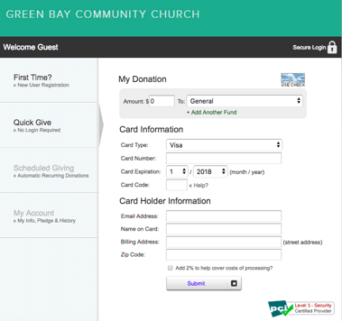 The design of your checkout page is equally as important as the design of your giving page. When a contributor gets to the checkout page, they are going to want to ensure their transaction goes through without any glitches. And they are not going to want to see any surprises or unexpected charges, like a surprise transaction fee or processing fee — be sure to be upfront about all charges.
This page should be designed in a way that makes the information clear and easy to understand. A great checkout page will stick to the following guidelines:
Make Your Forms Simple and Safe
In order to alleviate confusion, your checkout page should be simple and straightforward. Your forms should be short and your drop down choices should be easy to access. If your checkout requires the contributor to complete more than one step, there should be a way for them to see what step they are on and what steps they have left to complete. Your checkout form should never ask for the same information twice and you should make it easy to set up a recurring donation. You should also add something to the form to help givers know that their information is secure.
Customize Your Checkout Page
It's a great idea to customize your checkout page so that it matches or coordinates with your church website design. One way to do this is by using the same colors as the rest of your website. You will want to include your church logo on this page as well.
If there’s disconnect between the design of your website and your checkout page, it won't look trustworthy and it might scare away potential donors.
The more personal you can make your checkout page, the better.
Leave Out Sources of Friction
You don't want your donors to become annoyed or frustrated when they are on your checkout page. If it's too complicated or difficult to complete, it could cause them to cancel their donation or avoid future online giving. Some of the sources of friction you're going to want to leave off your checkout page include:
- Forcing the donor to register before checking out
- Having too many steps to complete
- Having to fill out unnecessary form fields (like for instance, requiring their telephone number or birthday)


