Meet Kirk in the Hills
Kirk in the Hills Presbyterian Church in Bloomingfield Hills, Minnesota, is a beautiful church with a history spanning over seven decades. It’s gothic architecture and soaring steeple make it a landmark that draws the community in to its picturesque grounds.
In August of 2019, our friends at Kirk in the Hills gave us a call. They had just gotten a new logo. They had recently landed on ministry priorities with fun new icons. They were ready to look to their web presence and tell their story!
Challenges
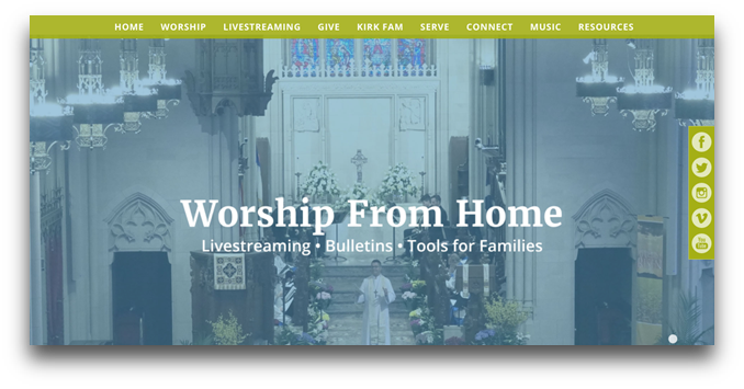
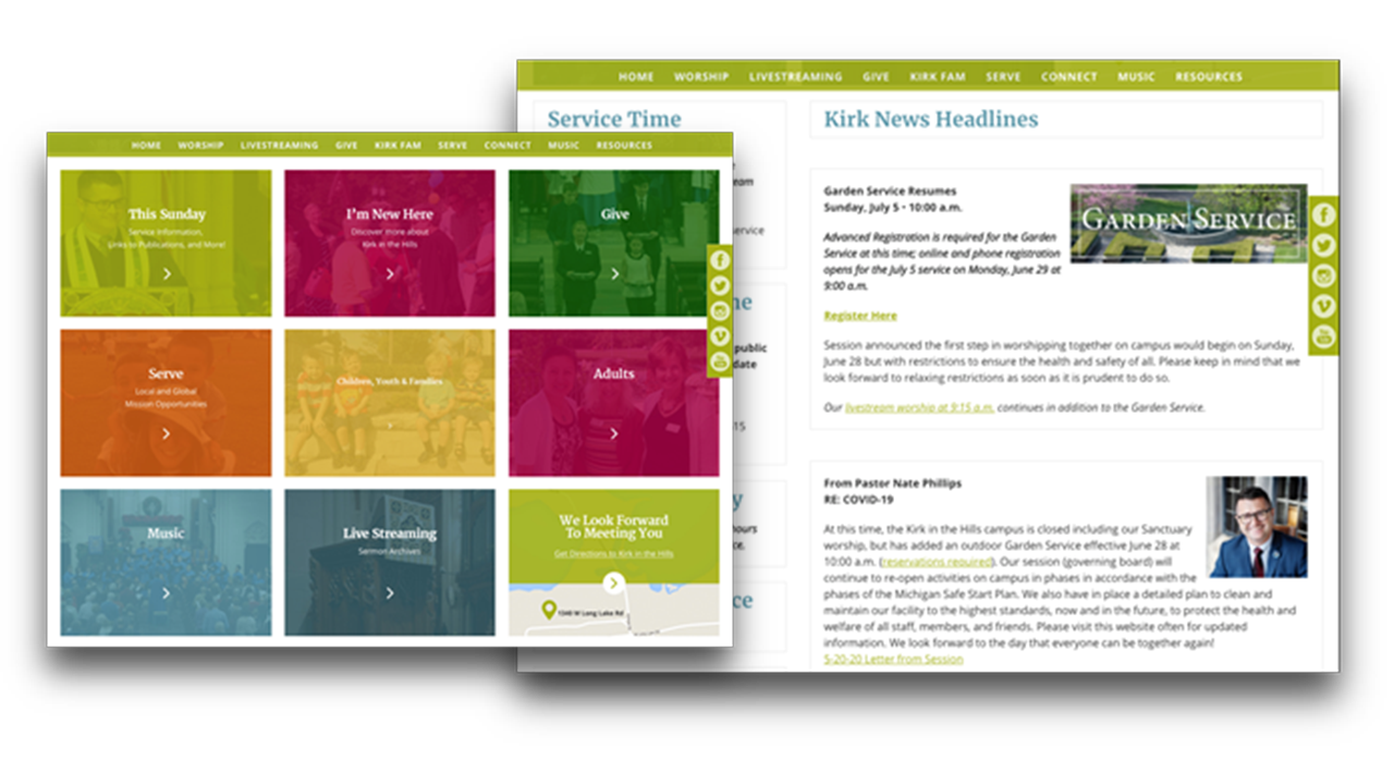
At that time, their website was almost 4 years since the last redesign. But over time, their site had gotten bogged down with “content creep” — the backlog of outdated content that never got removed.
Not to mention that, they had begun to experience some challenges managing their content on their Content Management System (CMS) and they were struggling to make their site what they wanted it to be. Even as they spoke with us pre-COVID, they were hoping to emphasize their livestream better.
Before

As our Strategy Team engaged with the team at Kirk in the Hills, we were able to identify additional areas where they could bolster their online presence.

Here are the big take-aways:
- Lots of text-heavy pages (which makes it hard for readers to scan)
- Not enough good leading photos that reflected the content they were inviting people into.
- The top-line navigation had several options that required insider information, which makes it hard for visitors to find what they need.
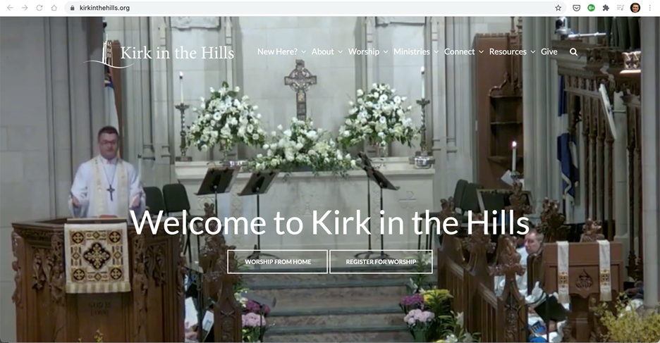
After
The staff at Kirk in the Hills — Nancy, Nate, and Kristen — worked with our Strategy Team on a Pro Strategy project to get an in-depth plan for rebuilding their site in a way that would optimize online ministry success — to help them tell their story and guide users on a journey into involvement with their church.
Here are some highlights:
- Visually engaging opening video that brings you into the life of the church.
- Top-line navigation that helps clarify user journeys for visitors, attendees, and members.
- Photos that tell the story of their ministries.
- Easy-to-find livestream
Check it out for yourself!
Ready for a Fresh Start?
It might be time for your church website to get a fresh start. But where to begin? When someone comes to your website, you don't just want it to look good. It has to have clear messaging, navigation, and functionality that supports your online ministry as another aspect of your church. Before you get started, you need a clear strategy and plan on how your site will give your visitors the best experience possible. Our team of strategists can help you get started with a free MOA (Mission Online Assessment) to look at your website with you and build out the next steps for your church.


