The summer season is upon us, with plenty of sunshine, beach days, and family time ahead. However, now is the time to start thinking about and planning for fall. Autumn is when ministry kicks up after all the summer vacations. School is back in session. People are returning to their routines. This includes more people attending church again. With all this in mind, it’s important to think about ministry-focused website layouts. That’s because your church website is where people will go to find more information about your church.
Planning ahead is key too. If you wait until the last minute to update your website, it’ll be too late. Start now to get everything ready for the influx during the fall.
Church Website Update
With all the new people and returning members after the summer fun, your website will be key to informing them about how to get plugged in. If your website hasn’t been updated in a few years, it’s especially critical to make some new modifications. Even if you’ve recently redone your church website, consider adding ministry-specific layouts. This will help your congregation even more because it will be user-friendly and easier to navigate.
Check out some of e360’s ministry layouts below.
Small Groups Layout
One way to really get people plugged into your church family is through small groups. People can connect with others in a smaller, more intimate environment than your weekend services. They can study the Bible, ask questions, make new friends, and build community. You’ll want people to easily be able to sign up for small groups. E360’s Small Groups Website Layout will help your people get connected.
With our classic, professional, or traditional layout options, the Small Groups Layout includes a small group “finder.” Users can use the interactive map and filters to find a small group that best fits their needs. People can search for a group based on location, life state, day of the week, childcare options, and more. Detail pages provide space to communicate logistics, leaders, and a description to help a user choose a group. Help people find ways to easily join the life of your church.
Church Hub Layout
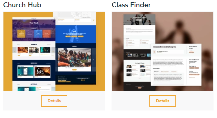
It’s important for churchgoers to know what’s happening at your church each week. Announcements, email, and social media are great ways to get the word out. But it’s important to have a place to direct them for more information. That’s where the Church Hub Layout comes in.
It is designed as a snapshot of your church website. Users can save the URL to their home screen or desktop and quickly access the latest events, media, and group info. It’s a quick way for people to find what your church is up to at a glance.
Class Finder Layout
Another way to help get people connected this fall is to offer classes at your church. This helps members grow in their faith and make new friends at the same time. The Class Finder Layout is a great tool on your website to help people find and register for classes they’re interested in.
It allows people to see all your current and upcoming classes in one helpful spot! They can filter by a category, day of the week, or childcare options. In this layout, you can include class descriptions, links for materials, and contact information for class leaders.
One of the great things about this layout is that classes are set up in our Events module, so when a class ends, it will automatically disappear from the page. No more worrying about editing your website the second a class is over or worrying someone will accidentally show up to a class that ended last week.
New Here Layout
After the summer sun fades away and autumn breezes roll in, you may see many new faces at your church. Because many people join a church as they’ve started their new routines with school and work. But before people set foot in your building, it’s most likely they found your church online first. That’s why it’s critical to have a helpful New Here Layout.
This layout, available in classic or modern, will help people understand what to expect when they show up to your church services. You can include the most important things, like location and service times, as well as directions on how to get there. Add info about parking or what your worship style is like. Don’t forget to include some of the various ministries that are available too!
Events Layout
Your church hosts some great events. Be sure people know they’re happening! One way to do this is to have a dedicated Events page on your church website.
The e360 Events Layout comes with a campus filter for multi-sites. You can color-code your event categories. People can view the events in list view or calendar view, and featured events are placed at the top of the page for easy access. Users will see all of the important events happening at your church, find out more info, and register!
Next Steps Layout
Once people attend your church and want to know how they can get further involved, direct them to your Next Steps page. It’s a great way for people to find everything they need to connect deeper with your church.
Let people know how to take their next step, whether that’s through a membership class, joining a small group, taking a class, or volunteering. This image-heavy design can help communicate a lot of information without overloading the user with text.
Website Layouts Designed for Your Church
Whether you’re just browsing what’s best for your church, you’re currently using an e360 theme, or you’d like to go custom, Ekklesia360 is here to help! Our church-specific website layouts are created to engage your visitors and get them connected. Contact us today to learn more about how to get the most out of our church layouts.


