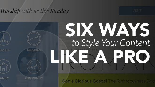
When you are on the search for a new church website, web design companies show portfolios filled with perfectly styled examples. Well-designed graphics and curated content make picking out the theme easy, but when it comes time to add your content, styling pages creatively can be tricky. Read on for 6 ways you can break out of your styling rut and create pages that clearly and creatively communicate the message of your church.
1. Use Quality Images
We have all seen websites with stock photography shot in the 90’s. Just as sad is the website with a mountain of text, and no images. You may not have access to quality photos from your events and home groups. Not every church is so lucky to have a photographer (if you are so lucky, treat them with love and respect) in their congregation. The trick is to use images that look like they belong.

I am here for you my friend. Here are some sites with fantastic free images, and some tips on how to creatively use them on your e360 Theme.
Free Stock Photos

Free stock photos not only exist, there are some great options. My go-to sites are:
- Lightstock - Sign up and receive a free faith-based photo and vector image each week, as well as a free video clip each month. Lightstock also has really great packages and reasonable pricing on their full library, so check it out!
- Freely Photos - Totally free high quality Christian stock photography.
- Pexels - Simple to use, searchable photo site. Easy and Free!
- Death to Stock Photo - Sign up for the DTS newsletter and you’ll get a set of free images each month. DTS delivers quality work and a well-written newsletter that I actually anticipate. Like Lightstock, they have some great subscription plans worth checking out if you have the budget.
- Pikwizard - Over 30,000 completely free, searchable stock images...need I say more?!
2. Simplify Communication with Icons
Another way to bring some interest to the content of a page is to add icons. Not only can icons bring some color and character, but used well, icons actually make it easier for visitors to quickly skim the page to find the content they’re looking for.
Free Icons
There are many sites with inexpensive, or even free icon sets. I suggest picking a set or series of icons for your site. That will help give a cohesive look. Here are some of my favorite resources:
Examples:
Here are some great examples of sites using icons to communicate their vision!


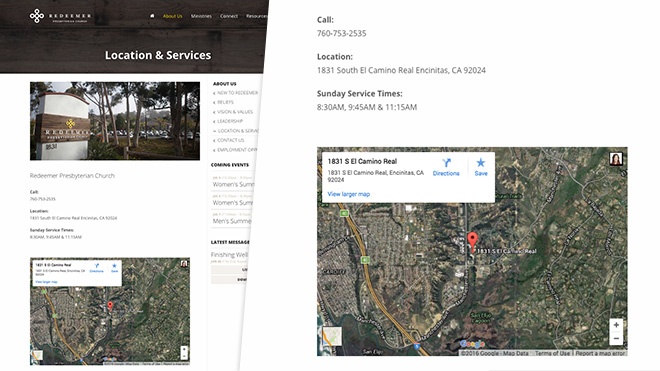
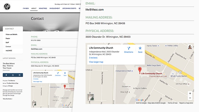
3. Make Visiting Easy with Maps
One of the most satisfying results of a successful church website, is when a new visitor says “I found your church online.” Let me make this as simple as possible: When adding content to your “Contact,” “Visit,” or “I’m New” page, be sure to add a linked address along with a Google map. This is one of the best ways to help visitors make the transition from website to pew.
Examples:
To make this extra easy for you, here’s a video: Inserting A Google Map Into A Page.
| Protip: If you have a map that isn’t responding well on smaller screens or your mobile device, check this out: Making Google Map Embeds Responsive |
Bonus Tips
Once you get your page set up and looking great, you may find yourself wanting to spruce it up even more. Every site has a few key pages, like “Next Steps,” or “Contact” that not only get more traffic, but also have a lot of work to do. These pages don’t just need to look good, but you want to use them as a powerful tool to encourage visitors to take action. If you’re ready to advance your page styling skills, we have some pro-tips to really engage your site visitors.
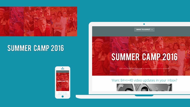
4. Add Character with Image Overlays
If you have a Section on your site where you can use an image background, overlaying a transparent .png file will allow you to layer images for a custom effect. When viewing the content on a tablet or phone, the background image will typically be cropped to accommodate for the browser width, but the overlaid .png file will be scaled down without cropping.
Examples:
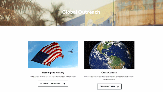
Beaverton Four Square Church - Background = ambiance, overlay image = meat and potatoes (or veggie-burger)
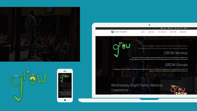
New Vision Life Church - Take a look at this page on your phone and see how the well the overlayed images and text respond to the smaller screen.
Think of your background image as a way to bring some interest to the content, but the transparent .png file as the way to deliver additional key information.
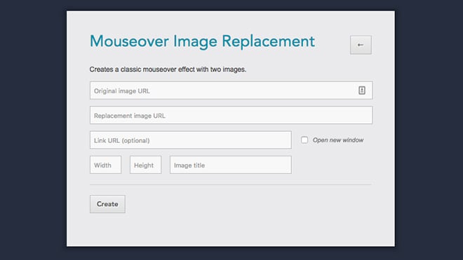
5. Get Fancy with DIY Hover States
Adding images to your page’s content is a great way to create interest and command attention. By using our Image Replacement Tool from the Ekklesia 360 Tools site, you can use two images to create a hover effect for linked images.
Example:
Crossroads Community Cathedral
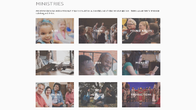
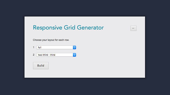
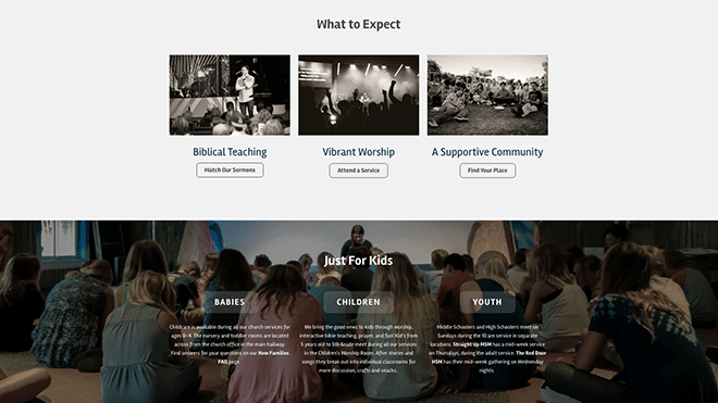
6. Customize with Responsive Grids
Grid layouts are handy when you have many calls to action to place on one page. You may want to create a grid layout for your Ministries, Sunday School Classes, or even your Next Steps. With a little patience, and some help from the Ekklesia 360 Tools site, you can use the Responsive Grids Tool to generate a custom layout.
Examples:
What will you do with these tools?
Leave a comment below and show us your results!


