What Is A Mega Navigation?
Definition: A larger navigation that allows for more content to be displayed.
A Common Misunderstanding
We've found, on average, churches have 93 items in their navigation. Which often leads churches to seek out mega navigation. The assumption is, if they have a ton of navigation items, then they need more room to display them.
This is a common misunderstanding, having a lot of navigation items doesn’t always mean you need a mega navigation. If you go with a mega navigation and don’t need it, you could accidentally create some issues for visitors.
Here are some common complaints we hear from church website visitors around navigation without proper planning:
“It is difficult to find what you want on the website.”
“I want a more logical way to find what I'm looking for.”
“It needs a more intuitive navigation.”
Having a lot of navigation items might actually be a sign that you need to rethink your overall content strategy and site structure. When we help churches through our content strategy sessions we only go with a mega navigation if it will help them reach their goals.
As you’ll see, the churches that are effectively rocking mega navigation are using them to drive people to take next steps. They are not using them to cram more navigation items on their website.
Vineyard Columbus
Within their mega navigation, Vineyard has images that draw your attention. Where they really stand out is the Watch & Listen. Each one links to messages and stories that share the mission and vision of the church. The images capture your attention more then any text hyperlink could.

Port City
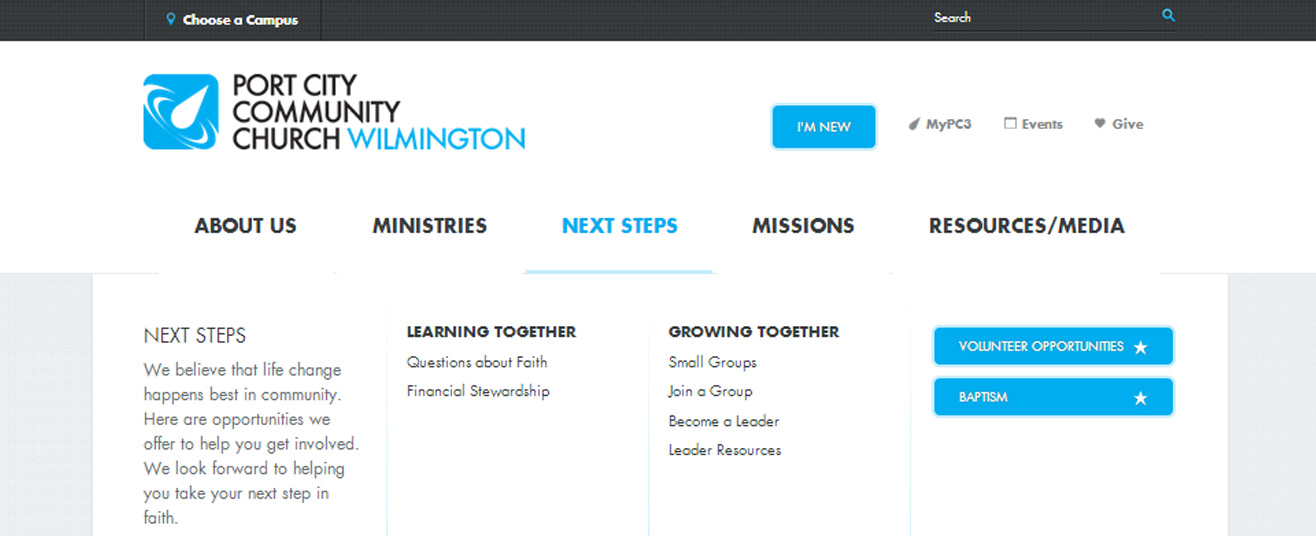
Port City makes the list because of the clear next steps included in their mega navigation. Under About Us, New To PC3, Times & Locations, and Newsletter Sign Up captures your attention, and they should. Each one helps visitors know what their next steps are.

Eagle Brook
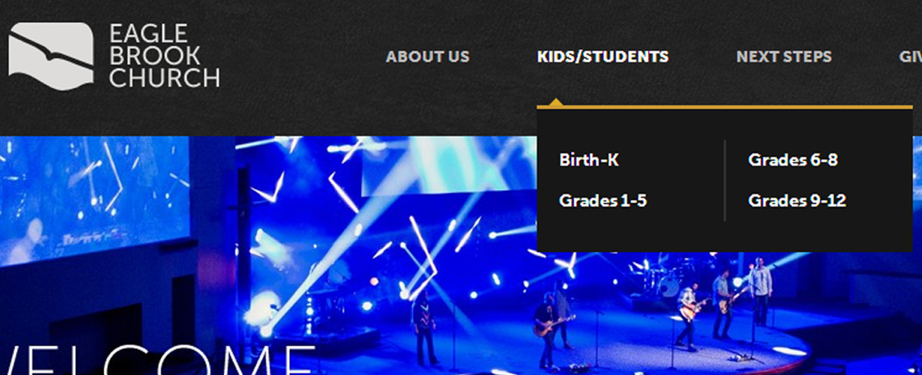
Eagle Brook is rocking a two column navigation. While it’s not technically a mega navigation, it is a great example of a different option. Why does it work? Because it helps keep navigation above the fold, so visitors can see all the options without having to scroll down. It’s simple to understand, easy to use and provides for great navigation.

The Village Church
The Village Church effectively uses a drop-down menu to help direct people to critical navigation items. They also placed navigation items into four general categories. It helps increase clarity around the information they want people to see.

Is Mega Navigation Right For Your Church?
Seeing all these examples might make you think, “My church website could use a mega navigation.” Before you make a decision, download our free eBook “A Practical Guide To Church Website Features.” It will help you know for sure.


