My grandparents aren’t exactly the definition of “techy”, but when it comes to mastering their smartphones, they’re on top of their game. Not only do they text, but they Facetime, Snapchat, and talk to Siri as frequently as some teenagers.
More than ever, senior adults are entering into our technology driven society and figuring out how to make it work for them. However, when it comes to your church website, they are still struggling to find what they’re looking for, sign up for events, and figure out how to give online.
Why is this? And how can we attract baby boomers and beyond by creating clean, effective church websites?
Take a look at these three reasons why senior adults aren’t visiting your church website, and find out what you can do to appeal to senior adults in a millennial driven tech world.
1. Clutter
Do you have to hover over two different menus, click on three different links, and then scroll to the bottom of a page to find the upcoming senior adult trip? If so, you need to eliminate the clutter.
When the senior adult pages and events (or any events for that matter) are buried under a pile of murky headlines and bulky menus, they won’t be found. Not only is this frustrating for your members, but it is discouraging to senior adults who are attempting to learn to be more efficient online.
Spend some time on your website examining what you can condense, eliminate, or move to help get rid of the clutter. Can you use tabbed or accordion style content instead of creating five separate pages? Can you redo your homepage with a minimal amount of clear call-to-action buttons and menu items? Could you simply move registration buttons to the top of pages, or increase your font size so that different headers and actions stand out? There are options!
Once you make some of these improvements, sit down with a senior adult in your church or on your staff, and watch them try to navigate your site. This may be telling about what is working well, and what isn’t. Listen, and make changes accordingly.
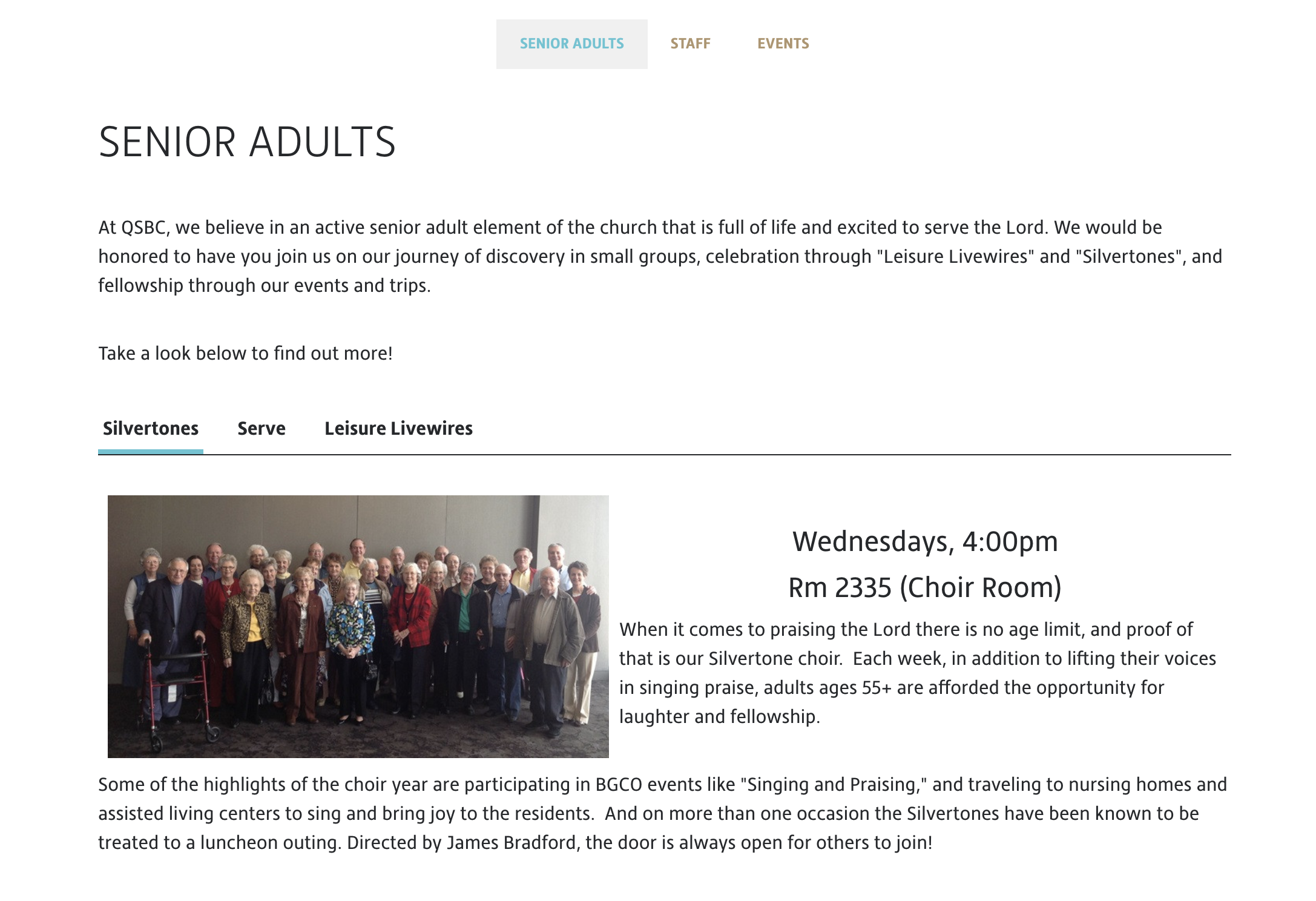
To get started, take a look at how Quail Springs Baptist Church created a specific page (using the ministry layout) just targeting their Senior Adults.
2. They feel like you aren’t targeting them online
They may be able to use their smartphones as well as some millennials, but they aren’t millennials, and if your website is solely targeted at twenty-somethings, you aren’t going to attract senior adults. What do I mean by this?
Do you have photos and videos of your traditional service online? Do you point people to your website in this traditional service and in your senior adult small groups? Have you worked with your Senior Adult Minister to show him how to navigate the website and help his people do the same?
If not, you aren’t working to target senior adults online, and they’re right in feeling like your website isn’t for them.
For years, the majority of senior adults resisted technology, but more and more this isn’t the case. In fact, 86% of adults 65 and older did not go online in 2000, but as of 2016, that figure has been cut in half.
Older adults want to utilize the resources that the web can provide, but if they go to your site and just see your contemporary service, small text, and photos of twenty-year-olds, they probably won’t come back. Take a look at your website through the lens of a senior adult and see if you would feel welcome walking in the doors of your church. Add content that is relative to them.
You should also work to promote your website in senior adult targeted promotional material. Add your URL to the church bulletin that they pick up, or to their small group guides. Work with your Senior Adult Minister to encourage members to find resources online.
When this generation sees that you’ve put effort into reaching them online, they’ll work to reciprocate by visiting and utilizing your website more and more.
3. Your website isn’t social
Relationships reign supreme among older adults. Many of them have visited the same doctors, attended the same small group, and shopped at the same place for years. As a whole, they value the familiarity and the relationships that these places foster, and they expect their online experience to cater to this as well.
As a church, how can you bring that same familiarity and relationship building experiences online in a user-friendly kind of way?
Make your content shareable. As mentioned before, many senior adults are on Facebook and other social media platforms, and they love to interact there. Write blog posts that they can share with their friends, add photos of their activities that they can post to their timeline, and upload sermons that they can easily email to a family member. In order for them to be able to do this, your social media and share buttons must be visible, clear, and easy to use. Maybe even add a “how-to share” paragraph on your Senior Adult page.
We love the “Share with a Friend” content at the bottom of each of Park Cities Baptist Church’s blog posts!

Another appealing option is to create easy to use forms. Can they request prayer on your site or reach out to their small group leader online? Are these forms easy to find? If not, they will be less likely to continue to visit because there is no relationship building.
Your website should provide content for Senior Adults to easily share and interact with if you want them to engage online.
So, if you’re noticing that senior adults aren’t visiting your website and aren’t engaging online, you may need to simplify the clutter on your site, work to target senior adults when promoting your website, and create more social outlets that they can easily engage with. We may be living in a millennial-driven tech world, but this doesn’t mean that senior adults can’t and don’t want to engage online. Make it your mission to takes steps forward in creating an appealing, senior adult friendly website today!


