
I’m no head chef, but I love to cook and experiment in the kitchen. I can sauté, fry, bake, steam, broil, and braise my way through any fancy dinner party, but when I first started cooking, I can tell ya—it was not pretty.

I’m talking burnt potatoes, rubbery shrimp, mushy broccoli… all the hiccups new chefs go through. But that’s the fun of it, right? When you’re exploring a new skill, it’s inevitable that you’ll make a few mistakes at the beginning! At the very least, it can make for a funny story.
If you decide to take over your church graphic design as a self-taught designer, you’re bound to run into a few mistakes, too—and that’s totally okay. But if you want to avoid looking like a total rookie, here are 9 tips to keep in mind.
[Parts of this post originally appeared on Tony Morgan's Unstuck Group. We are happy to share it with you, as well. This was also originally published in November 2016, and has been re-optimized and republished]
1. User experience, AKA “UX” should always be on the forefront of your mind.
Keep your audience in mind while designing. Your design can’t just be pretty—pretty things are a dime a dozen. But thoughtful design that’s easy for the user should always be the bottom line. It will help to ask yourself the following questions:
- “Where would the viewer’s eyes naturally go first?”
- “Is this easy to digest?”
- "Does this design follow a logical pathway?"
- Is all the key information easy to find and see?
Knowing the answers to these questions will dictate where you place your most important information and design pieces. For instance, if you want viewers to notice your CTA image, you'll want to make it bigger than the other elements on your page. For example, on your church website, other details that need to stand out include: contact information, service times, church location, and the new visitors section.
All of this leads to our next point…
2. Design for your visitor’s next steps.
People who are new to your church are looking for information about what to wear or where to park. Folks who are more engaged are looking for ways to get more involved, start to volunteer and give back to the community.
For example, on the “New Here” page, you should have information about nursery options, Statement of Faith and a Welcome note. Or on your mission page, perhaps you could include a link to a local ministry volunteering opportunity.
Start to think through how you could lead your congregation through your church website. Design space on the pages to provide those links. Think through the different paths and the information your website visitors will want at various stages. The churches mentioned here have good examples of this. But the real pro at this kind of thing is Amazon. If you have a movie in your cart, they recommend the sequel; if you’re ordering tools, they show the toolbox. Start to look for examples in your everyday life.
3. Design for an engaging experience.
One of the most effective things you can do is to visually draw your audience into the picture. A great design technique for doing this is called parallax and it’s easier to show than describe:
The Village Church and Red Stone Church are great examples of this in action.
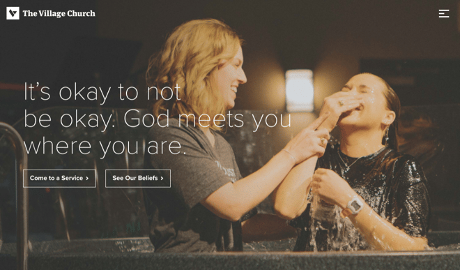
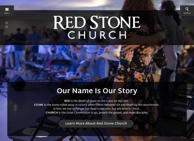
The parallax design fills the screen with a full-width image, adds text or other elements on top of it and you get a 3-dimensional feeling that you could “step into the picture” and join the congregation. The other trick with a parallax design is the way the panels scroll at different rates and keep the viewer interested and scrolling. This combination of visual and tactile connects with the viewer in a very strong way.
This is a compelling way to tell a story without stopping to tell the story. Your audience engages with the site and gets the full experience even before they start clicking around.
Important bonus tip: Keep your church website design responsive.
When was the last time you tried to pull up a website on your phone or tablet only to have to pinch and zoom and squint as you tried to read tiny type or menus that wouldn’t expand?
The answer is not bigger type, it’s a fully responsive design that actually displays differently on different devices. The menus still work, too! A great example is Providence Baptist Church. Pull them up on your phone and your desktop and compare the differences.
Just in case you didn’t hear it yet, mobile web usage now exceeds desktop web usage. Back in April 21st, 2015, the internet quietly experienced an event dubbed “Mobilegeddon.” On that day, Google started giving lower search rankings to sites that weren’t mobile friendly.
Did that affect your website? Hopefully not. But it’s more important than ever to keep up with modern design and technology. This tool can help you check your site: the Responsinator.
4. Don’t use too many fonts.
Whatever you're designing, from the church website or printed promotional material, using too many fonts can make it look pretty tacky in a big hurry. The basic rule of thumb is to stick with using two fonts. Every once in awhile, using a third might be okay. Only when you become a bit more confident in your design skills should you go off the beaten font path and try more than two or three. While choosing your fonts and how many of them to use, your focus should be on making the text as readable as possible.
5. Raster and vector images aren’t interchangeable.
As a graphic designer, you're probably not a total newbie so it's most likely you know the difference between raster and vector graphics and the best places to use each. But just in case, here's a quick review:
- Vector - From Wikipedia: "Vector graphics are based on vectors, which lead through locations called control points or nodes. Each of these points has a definite position on the x- and y-axes of the work plane and determines the direction of the path; further, each path may be assigned various attributes, including such values as stroke color, shape, curve, thickness, and fill." File types include .ai (Adobe Illustrator), .cdr (Corel Draw) or .svg files.
- Raster - From Wikipedia: "A raster graphic image is a dot matrix data structure, representing a generally rectangular grid of pixels, or points of color, viewable via a monitor, paper, or other display medium. Raster images are stored in image files with varying formats. File types include .jpg, .tiff, and .gif.

6. Don’t use too many stock photos
It’s a given that you shouldn’t use cheesy stock photos, but once you start using stock photos (especially the free ones) you'll probably start to notice that certain stock photos get cycled a lot through many different places online.
If you think a stock photo looks fantastic, chances are, many other people agree and have downloaded the same one. You'll also want to avoid having too many stock photos be the main focus of your designs, or you risk too many visitors thinking, "I've seen this photo everywhere."
One alternative of using stock photos is to use your own photographs (that is, if they are professional-looking enough). If you're stuck on stock photos, here are some great tips when it comes to their usage:
- Don't just throw in a stock photo just because it looks pretty, make sure it enhances—and relates to!— your content
- Make the stock photo your own by adding text or an overlay. Use these free tools to make them your own.
- High resolution stock photos can make great backgrounds for webpages to add visual interest without focusing on the image
7. Save your files correctly—it does matter.
Print work is usually set up as CMYK (cyan, magenta, yellow, and black) and at 300 dpi, while web work will be RGB (red, green blue) and the resolution can vary. In other words, when your output is on a computer monitor, it is best to use RGB.
If your output is a printed piece, use CMYK. The history and science of where these conventions come from is interesting if you want to geek out about design, but just follow these conventions. It will make your life easier.
Saving files for print work takes a bit more effort compared to saving files for web pieces. Here is a checklist to use when saving files for print:
- Ensure trim area is same size as final print product
- Most printers require a certain amount of internal and external bleed
- Images should be at least 300 dpi
- Send file to printer as a .pdf (as well as your original file if they ask for it, too)
- Embed all fonts
- Keep the file name short but make it descriptive
By saving your files correctly, it will save both you and the printer a lot of time and there will be fewer headaches for all involved.
8. Try not to over-do it—it’s very easy to.
Sometimes less is more. You can tell when someone has just discovered all the fun tools of Adobe products and that's not always a pretty day.
Because content and clarity is always king, you'll want to focus on what you're saying, not what you're designing.
Your viewers will get more out of the animation, special effects, photographs, and other fun elements you want to use, only when it adds to or enhances your content. You never want to take away or distract from what you're trying to say.
Because content and clarity is always king, you'll want to focus on what you're saying, not what you're designing.
9. Always keep flexibility in mind. You’ll be thankful for it later.
From one month to the next, a church can be very different. All of your church graphic designs should have multiple uses. You’ll thank yourself later when you’ve designed something that can be used for different purposes!
Having an area about special events can be really pointless and make your congregation looks pretty dead if it shows a calendar that happens to be empty. If you’re promoting a new sermon series or podcast, it would be great if you could use your web design to immediately grab your audience’s attention.
A great church website design can easily switch focus. Your website is like a little slice of life—you need a design that can grow and change through the seasons of your church.


