Deciding what to put or not put on your homepage can be tricky. On one hand, you want to showcase everything your church has to offer, but you also don’t want to overwhelm the site visitor.
A good place to start is to set clear goals and values for your homepage. Do you want your homepage to be welcoming? Do you want it to point towards a particular aspect of your church? Do you want the homepage to focus on helping newcomers navigate your church? Every decision to place something on your homepage should be based on goals that you have set beforehand, this way, what the visitor is presented with is focused.
Think of your website as your virtual church building.
The first thing you want to do with your site is to set the colors. The colors you select for your site will affect your visitors’ first impression. Selecting harmonious colors is tricky, if you do a good job, no one will notice but if you have a clashing color scheme it will be the only thing people will notice.
If you don’t know where to start with selecting colors, here is a helpful guide. And here is a good resource to help you pick colors if you are using one of our e360 Themes.
Homepage = The Front of Your Church Building
The home screen, or your homepage in its natural state, is like the front of the building. Most church sites have a rotator, looping video, or static image at the top of their homepage. Like the front of your actual building, it should be welcoming and give the visitor a sense of your church. Your menu and site-map are like a map to your building. They should be divided up into clear and intuitive sections that will help the visitor find what they are looking for.

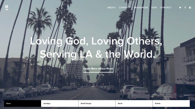
A good example of a looping video is Risen Church. You get the feeling that the church is very outward focused. Just by showing the video and overlaying text, they communicate what the primary focus of the church is.

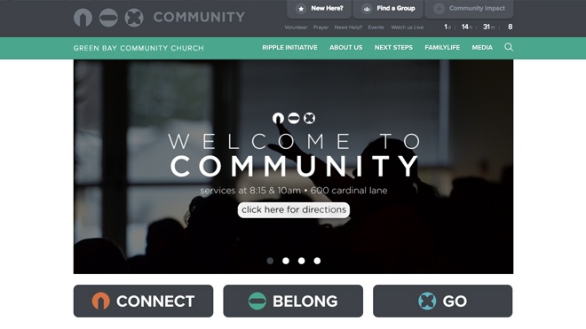
A good use of a rotator is Green Bay Community Church. They use the first rotor slide to welcome you to their church. And use the subsequent slides to promote different things happening at the church.
Scrolling Down the Homepage = Church Lobby
The homepage is the most visited page on your site. As you scroll down, it is like the visitor is entering into your church lobby. They will be able to find brief information about what else happens at your church. Many churches use featured links or sections to lead the visitor to other parts of the site. The links to your other pages should be obvious and easy to find. “Easy to find” doesn’t necessarily mean large and bold. It's fine to to ask people to scroll down a bit to find that section, but people shouldn’t need to go digging through pages and pages of your site to find what they are looking for.
Many church websites feature their blog, or upcoming events. This is when it’s important to remember the planning you did before you began. The things you feature on the homepage should be determined by what you want the visitor know about your church -- not just whoever asks when they catch you in the office. For example, if stories or small groups are an integral part of your church, then you can dedicate a section to just that.

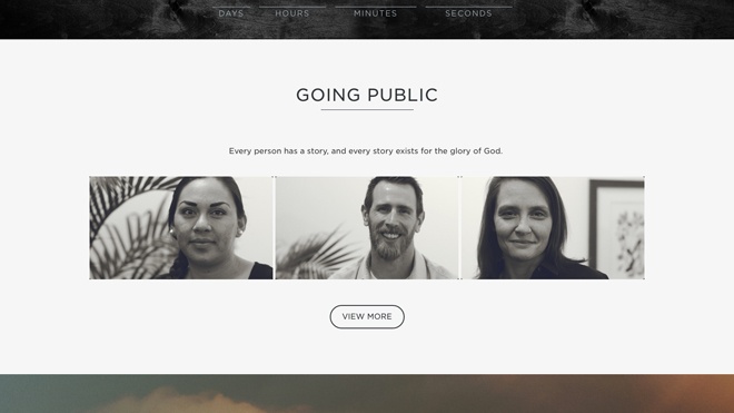
A good example of this is High Point Memphis. Their story section is low on the page, but their clean homepage layout allows them to have many sections. Everything is very easy to navigate and the viewer is already naturally scrolling to discover all Highpoint has to offer.
Links to Other Pages = Doors to Other Rooms
You should see the links from your homepage to your subpages as doorways to other rooms in your church. The visitor should know where that door leads to before opening it. Your description text before the button can help set up expectations for what the visitor will see before they even click on the link.
Livestream or Sermons Page = Main Sanctuary
If other pages are like different rooms in your church, then your livestream page or sermon archive is your online version of the main sanctuary or worship room. Like your physical church, the room where service takes place may not be the first thing you see when you get to the church, but it should be easy to find as you move through your church. Just like you wouldn’t expect people to go through a whole series of rooms to find your worship service.

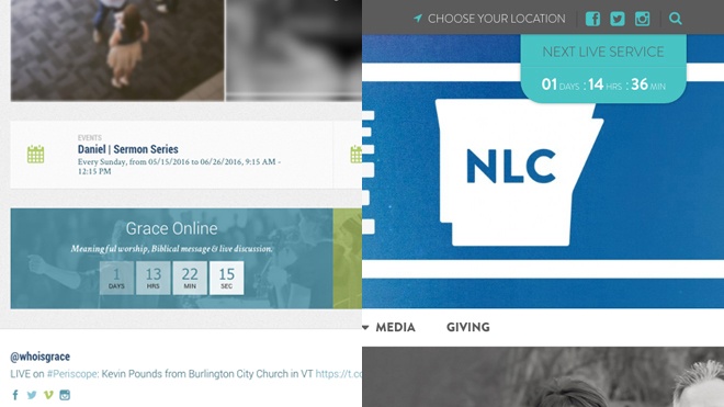
Two good examples are Grace Church (left) and New Life Church (right). Although each church has placed a link to their livestream in different places, both churches understand the importance of drawing attention it. Grace Church did this by giving the stream its own section. And New Life attached their link to the header and made it a color that will stand out against a photographic rotator.
Your Main Nav Menu = "You Are Here" Map
Here’s where the metaphor falls apart a bit. Most church buildings don’t actually have maps by the door (although some do!), but you should have some kind of wayfinding or signage. Whether you use big plastic stand up signs on the sidewalk, or smaller wall-mounted arrows, the goal is to make it easy for people to know where to go. Another way of saying that: your goal is to make it difficult for someone to get lost.
Imagine you’re on your church website for the first time (or in your church’s building). What is unclear? What doesn’t make sense? What is the most obvious? What looks good or bad? We’ve got some great articles about planning a site map. Again, the point is that you need to be aiming for clearly organized information. Your priorities are to serve “the public” of your church, not to treat any given ministry as the most important. Be kind as you communicate this to your team, but it’s important stay organized as a whole, so each ministry can thrive individually.


