Ekklesia 360 sees 2015 as a year of enhanced connectivity. Here are 5 church website design trends that will change the way people interact with your church’s website.
5 Design Trends for Church Websites
![]()
Storytelling
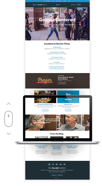 Scrolling, single page, and parallax design are trending for a reason. These design elements create an atmosphere that allow visitors to experience rather than merely click through mundane tabs. Instead of trying to make sure every critical piece of content is above the fold, now you can tell a story and be liberated knowing that people are visiting your site ready and willing to scroll.
One of our favorite examples of this storytelling approach on church websites is The Village Church’s new site. Visitors are naturally directed down the page by captivating imagery and current content. The new visitor is met with key location information as they scroll down to find resources, events, and stories of changed lives.
![]()
Personalization
In a time when we are met with endless options, it is easy to see how helpful personalization on the web can be. I recently encountered this during a Christmas online shopping session for my nieces and nephews. The “You May Also Like” feature made it incredibly easy to find gifts relating to what I was already looking for. The information I entered caused even more relevant information to rise up out of the noise. Take a moment to think about the possibilities for your church’s website. Your audience is not looking for that perfect toy, but they are searching. Why not make it easier? Personalization can help create connections to ministry that someone new to your church may not have even knew existed.
Your audience is not looking for that perfect toy, but they are searching. Why not make it easier?
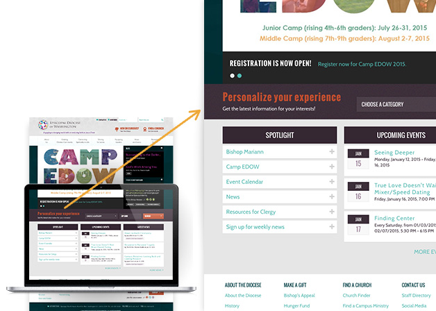
One recent project paving the way in personalization is the Episcopal Diocese of Washington (EDOW). EDOW has over 80 active churches with relevant news, resources and events. Visitors to the EDOW site simply need to self-select from a drop-down list, and enter their zip code to receive relevant information throughout the site. Using cookies, the EDOW site takes these selections and updates the featured news and events items to match the visitor’s criteria.
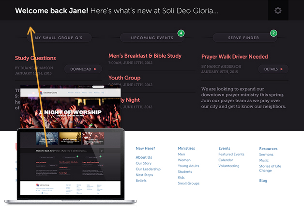
We dream of families visiting their church’s site and immediately seeing their small group’s study questions for the week, information for their child’s next youth event, or a new blog post from the missionary they support.
![]()
Responsive Design
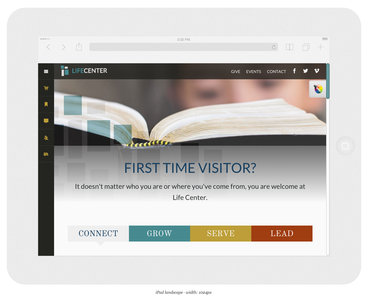
Internet browsing on phones and tablets is ever increasing. To meet this need, Ekklesia 360 has been almost exclusively designing responsive sites for several years. Pinching and zooming is for maps. Responsive church websites should be accessible on whatever device you are using. We feel this is so critical to a successful site that we removed all non-responsive designs from our e360 Themes. One of our latest designs, Faber, works great on everything from a phone to a 27” monitor.
Interested in seeing how your site looks on mobile devices? Check out the Responsinator.
Just type your website into the box on the upper left hand corner and hit "Go." In a few seconds, you'll see what mobile visitors will see when they come to your site.
![]()
Clear Next Steps
Creating clear next steps is the best way to start getting ministry results through your church’s website. Getting creative with design will allow you to direct the focus and increase awareness of visitors and engaged church members alike.
God has called you to lead and guide the people who come to your church. By setting up clear next steps, you're able to move people into deeper levels of engagement. Without them, people can easily get lost or distracted.
AJ Fenlason | Strategist
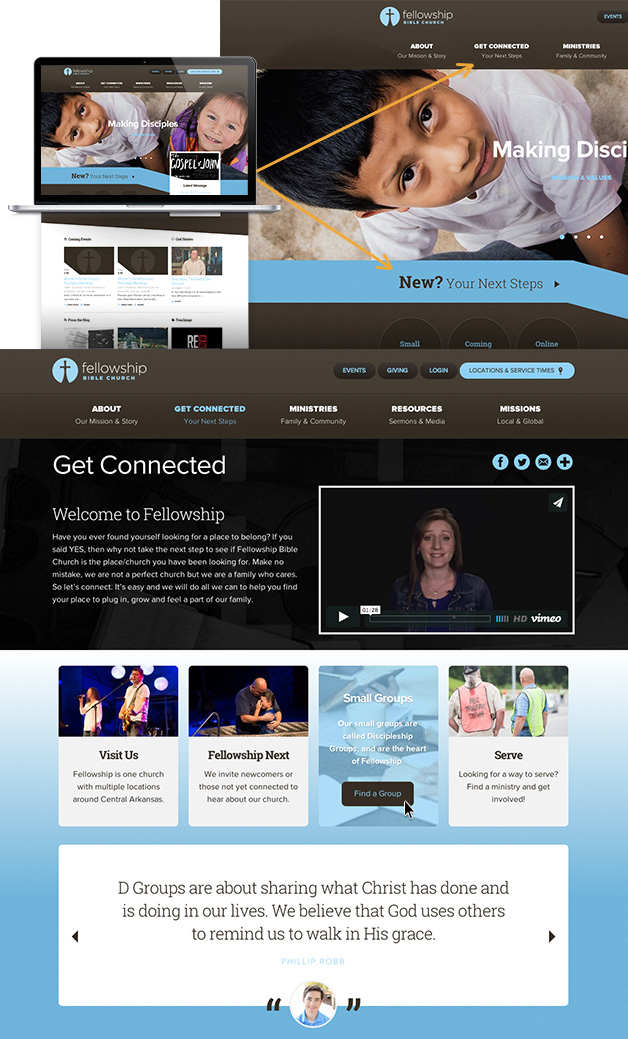
Fellowship Little Rock has two quick ways to get to their “Get Connected” page. Once on the page, a welcoming video and brief content gives an introduction to the church, and 4 personalized calls to action lead visitors to deeper engagement. Each “step” in getting connected is incredibly clear and inviting.
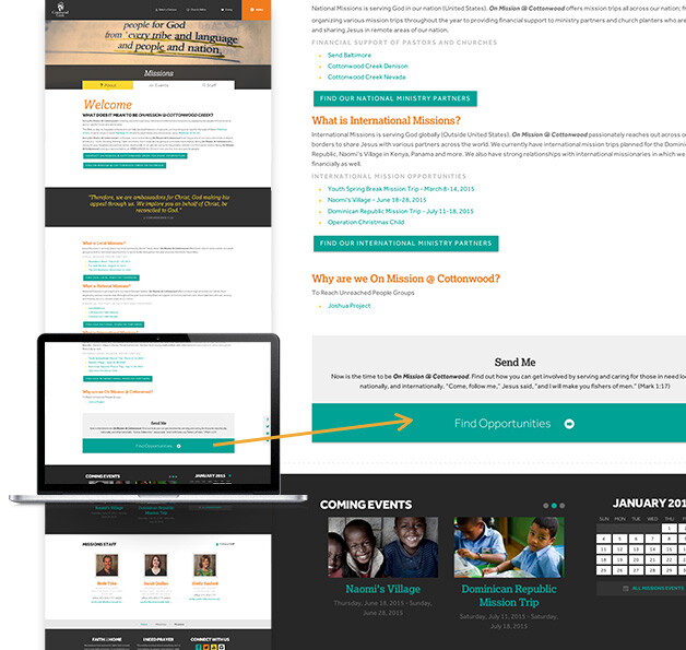
Cottonwood Creek’s "Missions" page provides information about missionaries the church supports and opportunities to get plugged in with missions work. While learning “About” missions, site visitors are met with a bold call to “Find Opportunities” at Cottonwood. Clicking that link takes the user to a pre-filtered event list.
![]()
Flexibility
We know how much the communication schedule of a church can vary from one month to the next. The typical church calendar has seasons of key content focus. Having a large area on the homepage dedicated to events can be really frustrating during a season with less on the calendar. Likewise if you are promoting the new church blog, it would be great to have it immediately grab your audience's attention.
A church website’s design needs to consistently represent the life of the church and act as a sort of snapshot. Flexibility is necessary to show what’s current, what to expect and how to get involved.
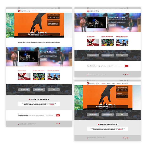
Eagle’s Landing has a bright and modern home page design that can easily be updated to meet their content needs. Everything from the image rotator down to the newsletter signup is optional. There are seven areas that can be placed on the homepage to quickly bring the focus from an event to the latest message or a call to action.
A church website’s design needs to consistently represent the life of the church and act as a sort of snapshot.
We’ve been working hard to bring this functionality to our latest e360 Themes. Here are some of our favorite examples.
e360 Theme L'Engel
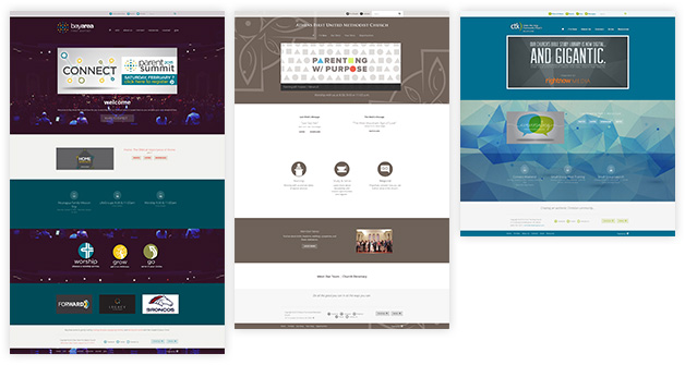
Bay Area First Baptist, Athens First United Methodist Church, and Christ The King Church Bellingham.
e360 Theme Hoornbeek
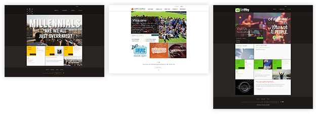
KCM, Christ Church Southampton, and Gateway City Church.
Let’s make 2015 the year that your church’s website greets new visitors with welcoming information and becomes part of your congregants daily online routine!

