Your ministry's image is important, there's no arguing with that. But what some people may argue about is how you're going to articulate this image. How is the logo going to look here? What will it look like on a white background? How does this design portray our "personality" to the world, and how it will stay consistent throughout all the things we do?
To avoid any discrepancies between anyone who does your church's graphic design, you need to have a concrete style guide to avoid confusion—we can't express how important this is! For all Ekklesia 360 custom websites, we always develop a style guide to go with it.
We've talked about what your style guide needs to include, and today we want to feature some style guides that real churches use. Check them out and use them as inspiration when you create yours!
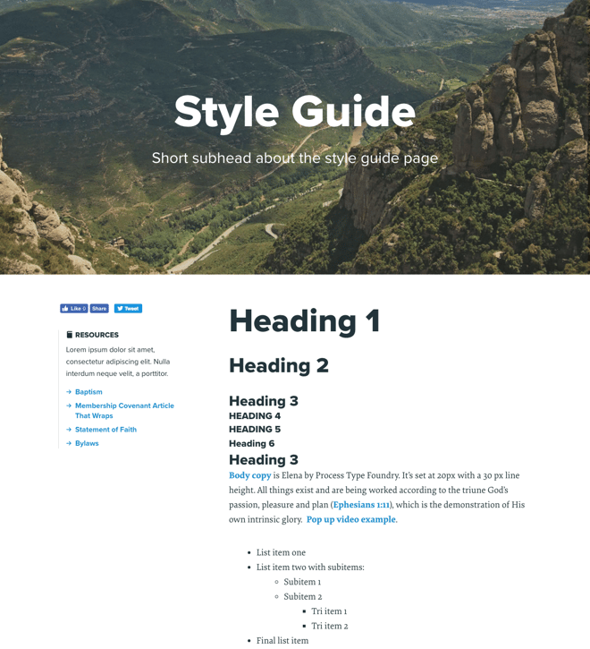
The Village Church
What we love:In the Village Church's style guide, they dive extensively on how to display their body copy. They show and explain why they use specific headers, and even explain sizing ("Body copy is Elena by Process Type Foundry. It’s set at 20px with a 30 px line height. "
First Church
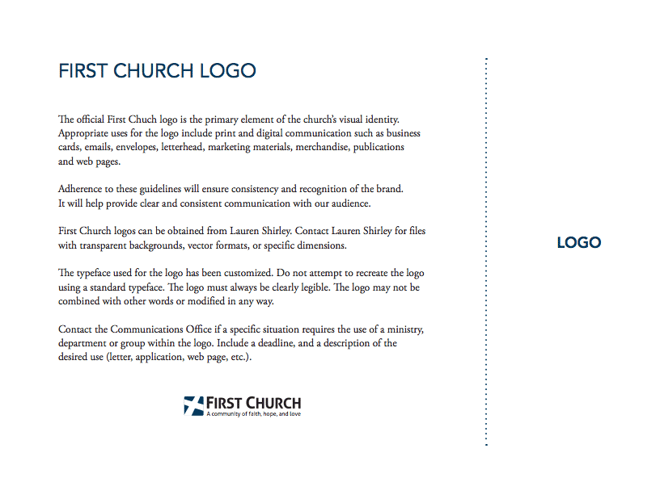
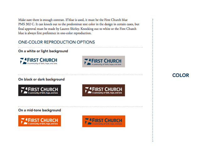
What we love:First Church takes their logo quite seriously—as they should! Their style guide includes in-depth descriptions of how to portray it. They talk about it very clearly in their guide. Check out this excerpt from it:
The official First Chuch logo is the primary element of the church’s visual identity. Appropriate uses for the logo include print and digital communication such as business cards, emails, envelopes, letterhead, marketing materials, merchandise, publications and web pages.
Adherence to these guidelines will ensure consistency and recognition of the brand. It will help provide clear and consistent communication with our audience.
First Church logos can be obtained from Lauren Shirley. Contact Lauren Shirley for files with transparent backgrounds, vector formats, or specific dimensions.
The typeface used for the logo has been customized. Do not attempt to recreate the logo using a standard typeface. The logo must always be clearly legible. The logo may not be combined with other words or modified in any way.
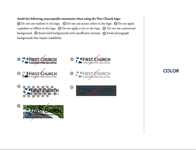
They visually show how you can use their logo, but the go the extra step to visually show how not to use their logo, as well.
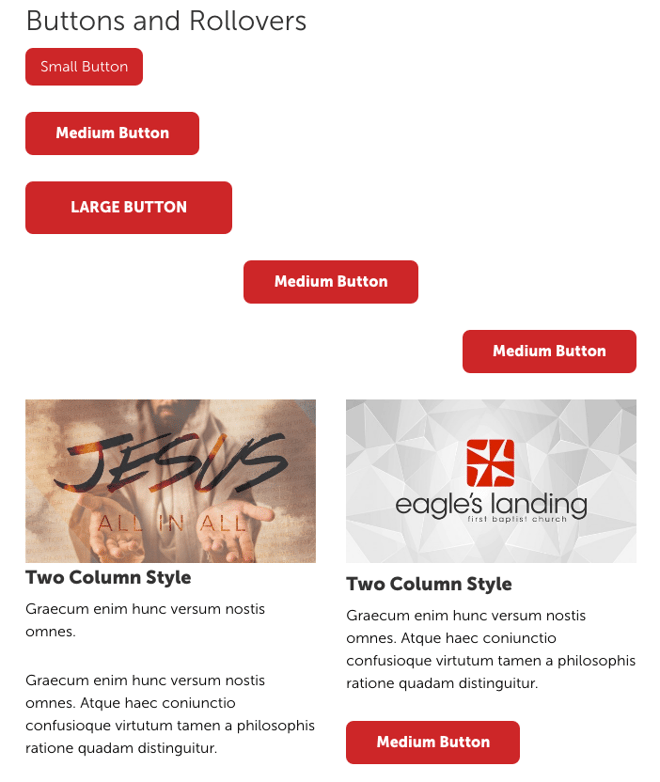
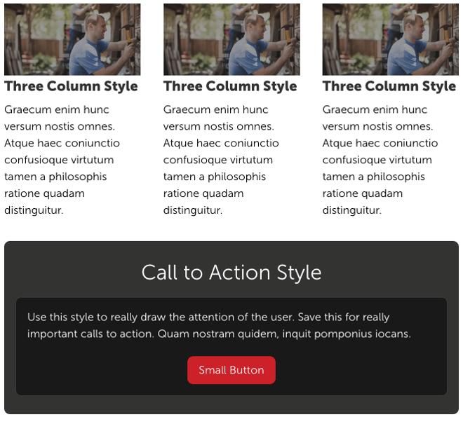
Eagle's Landing
What we love:Like the other style guides, Eagle's landing covers their bases for how body copy and styling should be with text. Additionally, since their website has lots of buttons, images, and columns, they include a section in their style guide that addresses those potential discrepancies, too.
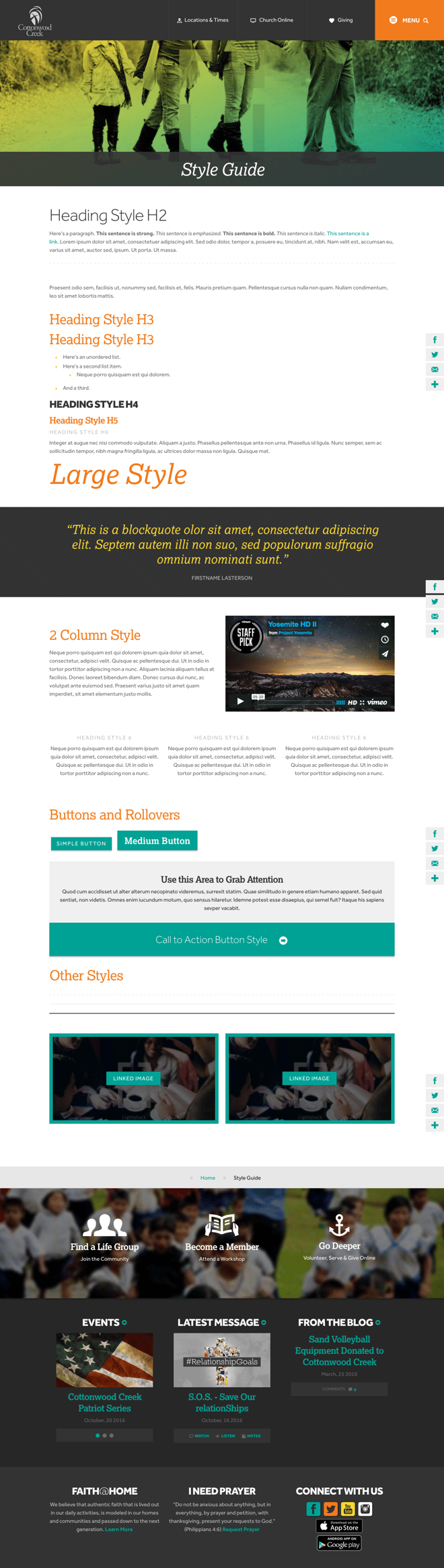
Cottonwood Creek
What we love:Check out their style guide! It looks just like a normal page on their website, and all of their graphic pieces have an explanation to it. Anything that is not in latin is a clear-cut explanation of what it is and why its used—all in a pretty package.