
We love data. Data tells us stories and allows us to more easily see opportunities for growth. Whether you're looking for the best times to post on your social media channels, what types of church blog posts resonate best with your congregation, or which pages gets the most visits on your church website, data tells it all.
With your church website, you likely have access to some of that data, like how many church website visitors you get a day and which pages are the most popular. While this is valuable information, wouldn't you like to see how your visitors behave on your church website? Where do they click? What can they see?
You know what we love more than data? Free data.
Hotjar is a powerful tool that shows you how people behave on your website through the use of recordings, heatmaps, and other pieces of information. You can use it on 3 website pages for free on Hotjar. We tried it ourselves and learned a lot of valuable things about ekklesia360.com and immediately wanted to share it with our crew of communicators—that's you!
Here's how Hotjar works, how we used the free trial, and what you can learn about your church website.
What You Get
With your free trial, you get to select 3 of your church website pages to analyze. You can get a lot of data with Hotjar through heatmaps, recordings, forms analysis, surveys, and more. But for the purposes of your website, we'll be focusing on heatmaps and recordings. But don't worry—you'll still get a lot of insight.
Heatmaps - A representation of data where values are represented by colors. Typically for a website heat map, the red areas are the areas that receive the most engagement, while blue or gray represent the least amount.
Recordings - Actual recordings of your church visitor's screens while they're on your site.
Forms - You can see when and why your visitors leave your forms. It'll show you which questions they stop filling out, and at which points they choose to click away.
There are just a few things to note for your free trial.
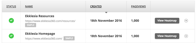
Below, you'll see a screenshot of Ekklesia360's free trial. It's not a coincidence that both pageviews are at an exact 1,000 views—with Hotjar free, you have a cap of seeing 1,000 views. Here's an important thing to know:
These are not the first 1000 views that hit the page, these are 1000 randomly selected visitors.
This is true across the entire platform. Whether they're giving you your heatmap or recording, all of their data is taken from randomly selected visitors to your pages.
Choosing Your 3 Pages
We've found that 3 free pages is plenty of information to find new opportunities for our website. But once you choose 3, you can't go back and choose new ones.
Here's how you make the right choice:
We recommend you look at your metrics to see which pages get the most views, and then consider what pages are most important for furthering your mission and engaging viewers to act. If your top 3 most viewed pages are things like your staff page, location, and mission, maybe choose the next 3 that are more dynamic and need more engagement: like your small groups, new member interest, and your homepage.
The pages you should choose ultimately come down to what you want to know to make improvements on your website.
Two of the pages we wanted to learn more about were our homepage and our resources page—keep reading to see how we used Hotjar's heatmapping software.
How to Use Your New Information
Heatmaps for clicks
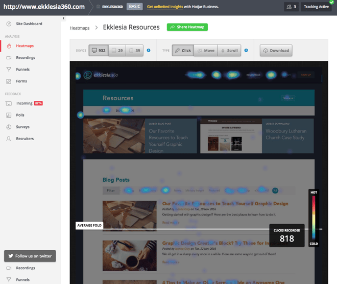
This may be your first glimpse at the heatmap tool in Hotjar. Right off the bat, you can see that there are 3 different types: clicks, move, and scroll. You can also see what type of device these 1,000 visits were made on (the majority of our visitors come from desktop computers—it might be different for your on-the-go congregation and you might find people looking at your website on their phones!).
These little orbs of blueish yellowish light indicate—you guessed it—where the visitors are clicking. The fainter the orb, the less that area gets clicked. The brighter and more yellow-ish the orb, the more people are clicking.
What you'll learn:
1. What type of information your visitors are interested in (a lot of our visitors are interested in design blog posts, for example).
Do your church website visitors tend to click on the events page? The calendar? The volunteer page? If people are looking for that type of information, you could add more helpful content to those pages, or even add your "donate!" or "volunteer!" buttons to those pages.
2. If your visitors are clicking in places that look like they would lead to a new page, but actually don't.
Maybe it's a photo of your staff or an image that looks like a button. This could be your cue to make those clickable-looking spaces a link to another page on your church website.
3. If your actual buttons are being clicked.
With this heatmap, you might find out that, while people are clicking the "donate" button on your homepage, it's not being clicked on the events page. That might mean you should replace the latter with something more engaging or test some new language.
Heatmaps for scroll
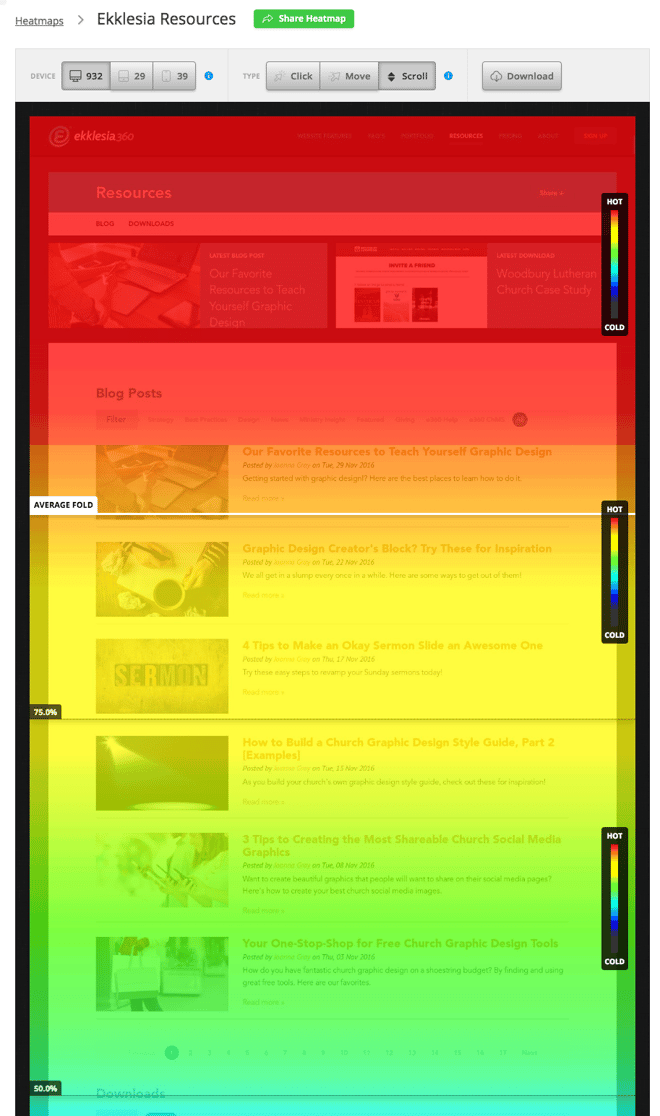
Here's a look at part of our scroll heatmap on our resources page. Everything that is red means that 100% of this page's visitors see that part of the page. They also show a nifty line to indicate the average fold of the 1,000 visitors to this page. Naturally, the further you scroll down the page and past the fold, the "colder" the heatmaps get—fewer and fewer people will get to the bottom.
What you'll learn:
1. If visitors are seeing your content.
Have you ever wondered why you aren't getting a lot of sign-ups to volunteer for your event? If the form or sign-up button is too far down the page, it might simply be because fewer people are seeing it. Maybe your website visitors do want to volunteer or sign up––they just didn't see the button. Even moving it to juuust beneath the fold can make a huge difference in how often your content is seen.
2. Where to place your content.
You won't be placing your "sign up to volunteer!" buttons below the fold anymore! Keep your most important information in the red areas of your pages.
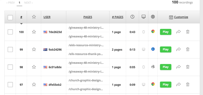
Recordings
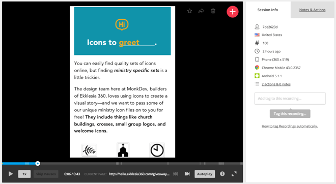
Hotjar gives you the tools to be in your church website visitor's shoes. With your free trial, you get 100 free random recordings.
These recordings are precisely what you're thinking: they're short videos of the screen your visitor sees as they're scrolling, clicking, and moving their mouse. But here's one important thing I want to emphasize: your visitor's identity is safe and anonymous. The only information you're given is the country they're viewing your site from—you will never see or hear them.
What you'll learn:
1. How quickly visitors scroll.
For example, if you see a recording of a visitor on one of your blog posts you can find out if they're skimming or actually reading. Are they scrolling quickly? Or are they taking their time?
2. What pages they see per visit to your website.
For the duration of your visitor's time on your church website, you can see which pages they visit at a time. One of your visitors may be reading a story on your church website's blog about a volunteer's missionary trip. You see him start a the top, slowly scroll all the way to the bottom as he reads. He may even click the "volunteer" tab in your navigation once he's finished and read about volunteer opportunities at your church!


